Help us build this. Leave comments, suggest improvements, and help create better design documentation for agents.
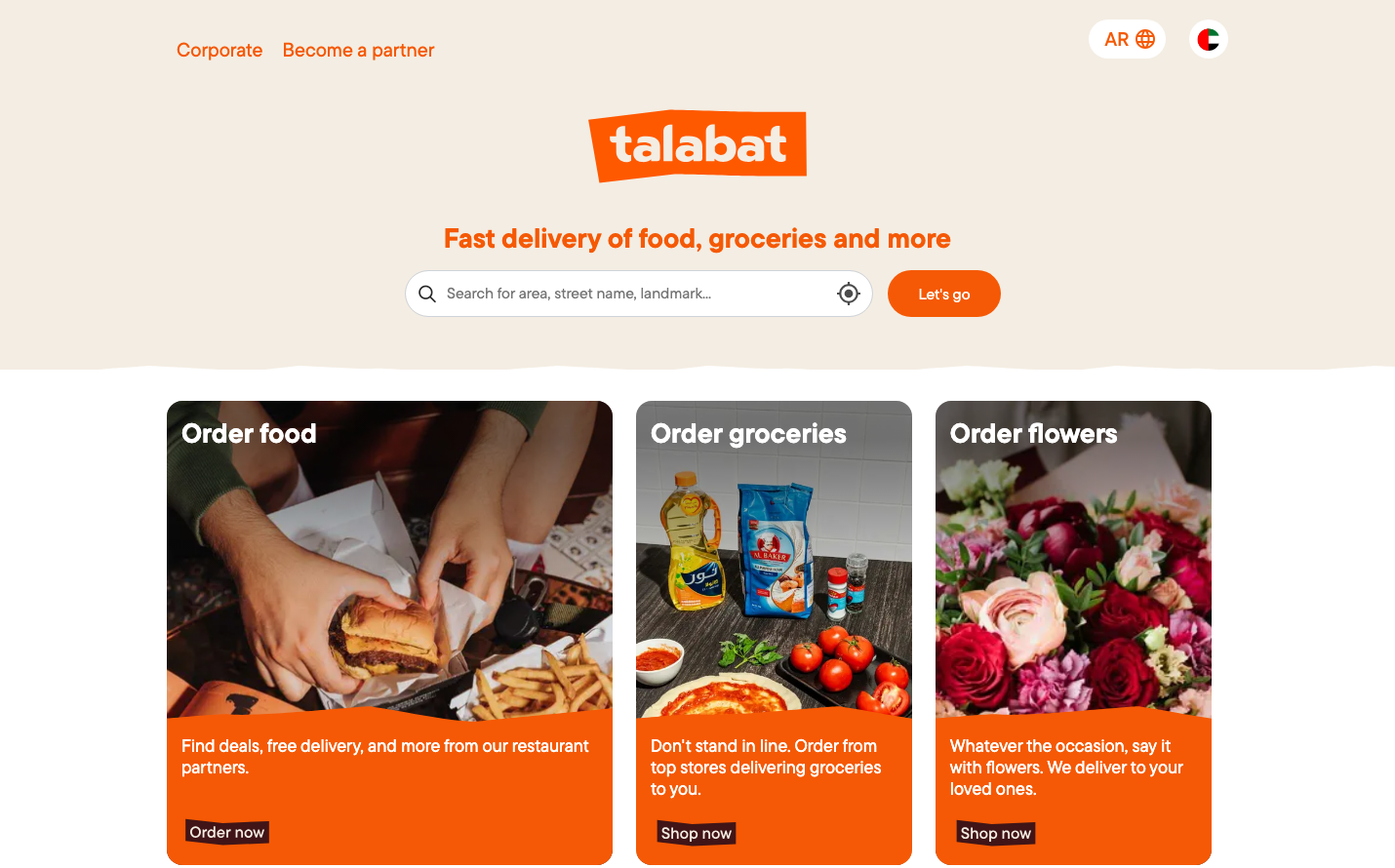
Talabat
FoodTalabat's brand radiates warmth and appetite through its dominant orange palette, creating an inviting food-focused atmosphere. The TTCommons typography feels approachable yet confident, while the service-specific color coding (red for restaurants, yellow for groceries, pink for flowers) creates an intuitive visual language that transforms delivery into lifestyle categories.
Design Identity
Signature Color
Talabat Orange
#ff6600
appetite-stimulating warmth and instant gratification energy
Visual Identity
The warm beige background combined with vibrant orange accent blocks creates a distinctive 'warm minimalism' - clean layout elevated by food-centric color psychology and category-specific color coding.
Component Style
Rounded, pill-shaped buttons with substantial padding feel welcoming and tactile. Cards have generous corner radius and warm orange overlays that feel like digital food packaging. No harsh shadows - everything feels soft and approachable.
Spacing Philosophy
Generous breathing room around hero elements with tight, efficient spacing within cards. The three-column card layout creates balanced visual weight while maintaining focus on the central search experience.
Design Principles
- Service categories get unique brand colors (red=#ff493d, yellow=#f4aa33, pink=#e93c82)
- Primary CTAs use pill-shaped buttons with ~24px border radius
- Warm beige backgrounds (#f5f0eb) create food-friendly warmth
- Card overlays use 16px padding with rounded corners
- TTCommons font family across all text elements
Target Audience
Busy urban consumers who want convenience without sacrificing quality - people who see food delivery as lifestyle enhancement rather than just utility
Mood
Design descriptions are AI-generated based on visual analysis and may not fully reflect the brand's official design guidelines.
Design System
Typography Scale
| Element | Font | Size | Weight | Line Height |
|---|---|---|---|---|
| body | 13px | 400 | 18.5714px | |
| h1 | 28px | 600 | 33.6px | |
| h2 | 28px | 600 | 16px | |
| h3 | 20px | 500 | 24px | |
| p | 18px | 500 | 22.14px | |
| a | 20px | 500 | 43px | |
| button | 16px | 400 | normal | |
| input | 16px | 400 | 22.8571px | |
| nav | 13px | 400 | 18.5714px | |
| header | 13px | 400 | 18.5714px |
Color Palette
#fca06f#ff493d#f4aa33#e93c82#3d76ed#e5e5e5#aba9ab#007aff