Help us build this. Leave comments, suggest improvements, and help create better design documentation for agents.
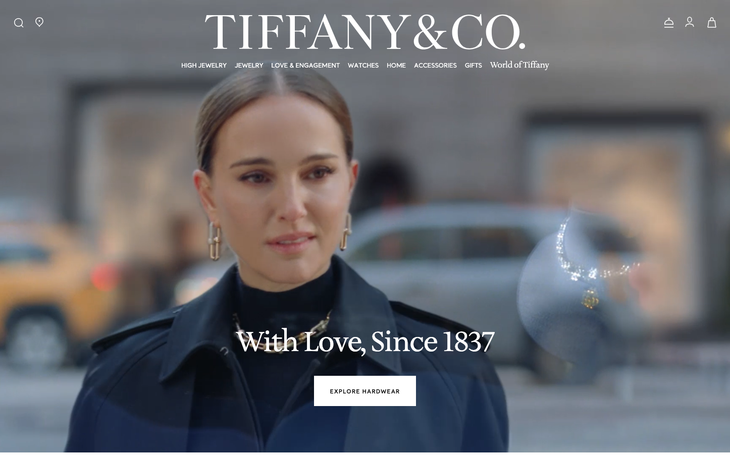
Tiffany
LuxuryTiffany's brand aesthetic embodies timeless luxury through ethereal white space and sophisticated serif typography that whispers rather than shouts. The palette evokes heritage craftsmanship and aspirational elegance, while the typography tells a story of American luxury heritage - refined, confident, and eternally sophisticated.
Design Identity
Signature Color
Tiffany Blue
#0078BE
Iconic luxury heritage and exclusivity - the most recognizable color in jewelry
Visual Identity
Generous white space combined with delicate serif typography creates an unmistakable sense of luxury restraint - every element breathes with the confidence of a heritage brand that doesn't need to try hard.
Component Style
Understated rectangular buttons with minimal styling and generous letter spacing. No heavy shadows or dramatic borders - everything feels refined and effortless, like luxury items displayed on white velvet.
Spacing Philosophy
Luxurious breathing room with expansive white space that creates a sense of exclusivity. Large gaps between sections mirror the careful curation of a high-end jewelry display case.
Design Principles
- Typography mixing serif Sterling SSM for headlines with sans-serif Santral for utility text
- Ultra-light font weights (325) for headlines to feel delicate yet authoritative
- Generous line heights (64px for 52px text) create airy, readable luxury
- Minimal button styling relies on typography rather than heavy visual treatment
- White space dominates layouts to create premium positioning
Target Audience
Affluent consumers who value heritage craftsmanship and understated luxury over flashy displays - those who appreciate subtle sophistication and timeless design
Mood
Design descriptions are AI-generated based on visual analysis and may not fully reflect the brand's official design guidelines.
Design System
Typography Scale
| Element | Font | Size | Weight | Line Height |
|---|---|---|---|---|
| body | 16px | 400 | 24px | |
| h1 | 52px | 325 | 64px | |
| h2 | 32px | 500 | 38.4px | |
| h3 | 48px | 325 | 56px | |
| h4 | 24px | 500 | 28.8px | |
| p | 20px | 325 | 28px | |
| a | 16px | 400 | 24px | |
| button | 20px | 400 | 20px | |
| input | 16px | 400 | 24px | |
| nav | 16px | 400 | 24px |
Color Palette
No colors extracted