Help us build this. Leave comments, suggest improvements, and help create better design documentation for agents.
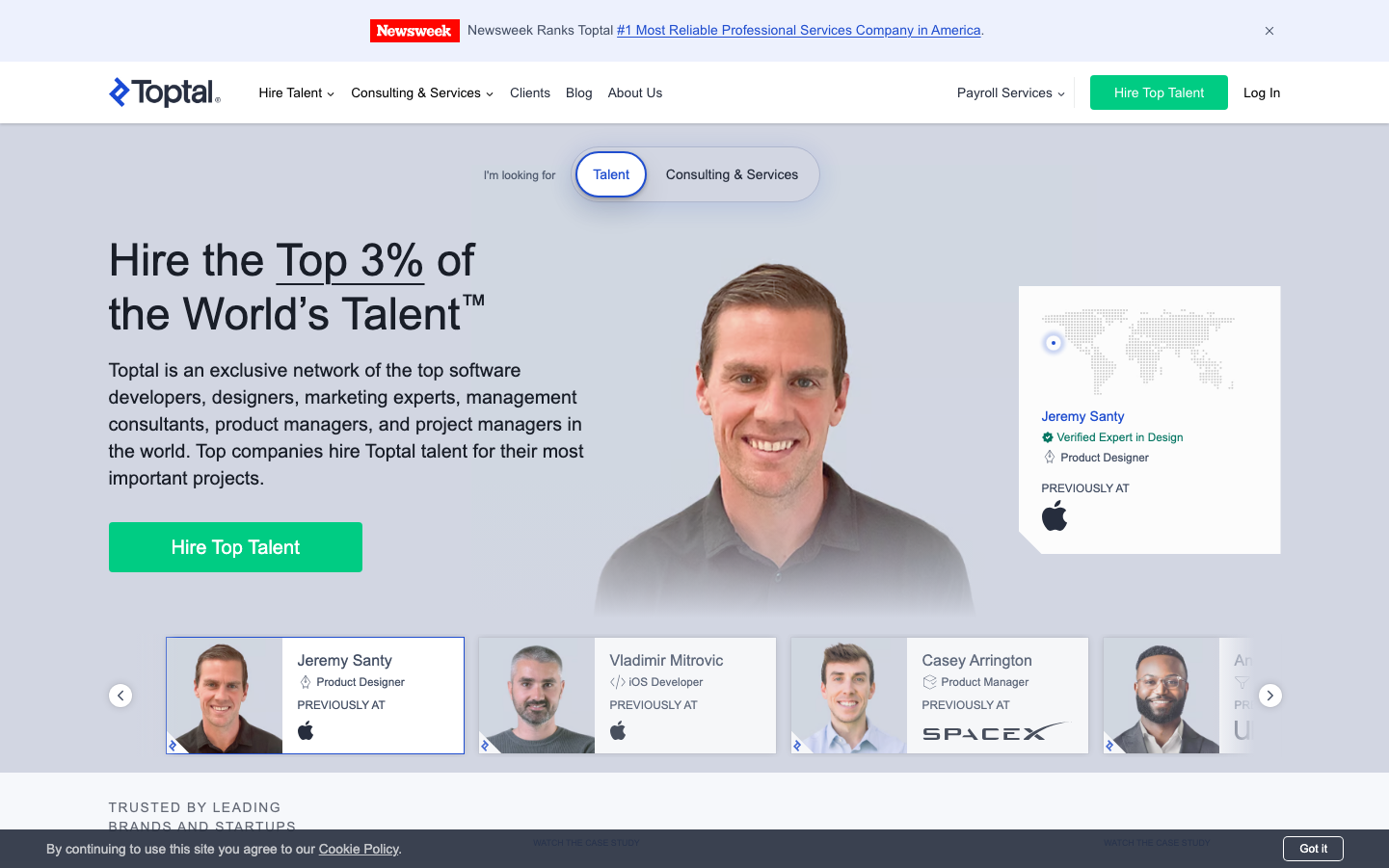
Toptal
Job PlatformToptal's brand exudes premium exclusivity through a confident blue-dominated palette that suggests elite professional networks. The typography is authoritative yet approachable, with Proxima Nova creating a sophisticated corporate tone that balances accessibility with high-end positioning.
Design Identity
Signature Color
Toptal Elite Blue
#4285F4
premium talent network authority - conveys trust, exclusivity, and professional excellence
Visual Identity
The prominent talent profile cards with company logos (Apple, SpaceX) create an immediate association with elite professionals, while the asymmetric hero layout with large headshot photography distinguishes it from typical job platforms.
Component Style
Rounded modern cards with subtle shadows and clean borders. Buttons use moderate 8px radius with solid fills. Profile cards feature prominent headshots with company logo badges, creating a premium talent showcase aesthetic rather than sterile corporate components.
Spacing Philosophy
Generous hero section breathing room with asymmetric layout - large left text block balanced by prominent right-side talent profile. Tight internal card padding maintains information density while wide section gaps create premium feel.
Design Principles
- Proxima Nova exclusively at 600 weight for all headings
- Blue CTA buttons always use vibrant primary blue with white text
- Profile cards always feature company logos as credibility indicators
- Hero sections use 2/3 - 1/3 asymmetric layout splits
- Body text maintains 14-16px sizing for readability
Target Audience
Senior-level professionals and hiring managers at Fortune 500 companies seeking exclusive access to top-tier freelance talent
Mood
Design descriptions are AI-generated based on visual analysis and may not fully reflect the brand's official design guidelines.
Design System
Typography Scale
| Element | Font | Size | Weight | Line Height |
|---|---|---|---|---|
| body | 16px | 400 | normal | |
| h1 | 46px | 600 | 56px | |
| h2 | 46px | 600 | 56px | |
| h3 | 20px | 600 | 28px | |
| p | 14px | 400 | 20px | |
| a | 14px | 400 | 20px | |
| button | 12px | 600 | 16px | |
| nav | 14px | 400 | normal | |
| header | 16px | 400 | normal | |
| footer | 16px | 400 | normal |
Color Palette
No colors extracted