Help us build this. Leave comments, suggest improvements, and help create better design documentation for agents.
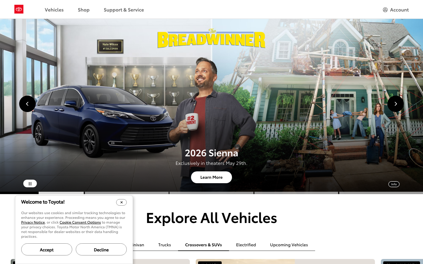
Toyota
AutomotiveToyota's digital identity embodies approachable automotive authority through clean, trust-building white spaces and confident red accents that communicate reliability without intimidation. The typography hierarchy uses multiple Helvetica variants to create subtle sophistication while maintaining mass-market accessibility.
Design Identity
Signature Color
Toyota Red
#EB0A1E
Automotive heritage and passionate reliability - the color of performance without pretension
Visual Identity
Expansive white backgrounds with strategic red punctuation marks, creating an almost showroom-like sense of space and focus that makes every element feel premium yet approachable.
Component Style
Rounded-corner buttons with generous padding and soft shadows, creating touchable, friendly interfaces that feel substantial but never aggressive - everything has a gentle, automotive-grade solidity.
Spacing Philosophy
Showroom-inspired breathing room with large gaps between major sections, mimicking the way vehicles are displayed with ample space to appreciate each element independently.
Design Principles
- Typography uses three distinct Helvetica weights for clear hierarchy
- Red accents used sparingly for maximum impact
- 32px headlines create strong focal points
- 16px base font size ensures accessibility
- Rounded corners never exceed automotive-inspired curves
Target Audience
Practical family decision-makers who value proven reliability over cutting-edge innovation, seeking trustworthy automotive solutions without complexity
Mood
Design descriptions are AI-generated based on visual analysis and may not fully reflect the brand's official design guidelines.
Design System
Typography Scale
| Element | Font | Size | Weight | Line Height |
|---|---|---|---|---|
| body | 16px | 400 | 16px | |
| h2 | 32px | 400 | 40px | |
| h3 | 16px | 400 | 24px | |
| h4 | 32px | 400 | 40px | |
| p | 14px | 400 | 22px | |
| a | 14px | 400 | 20px | |
| button | 16px | 400 | 32px | |
| input | 16px | 400 | normal | |
| nav | 16px | 400 | 16px | |
| header | 16px | 400 | 16px |
Color Palette
No colors extracted