Help us build this. Leave comments, suggest improvements, and help create better design documentation for agents.
Truora
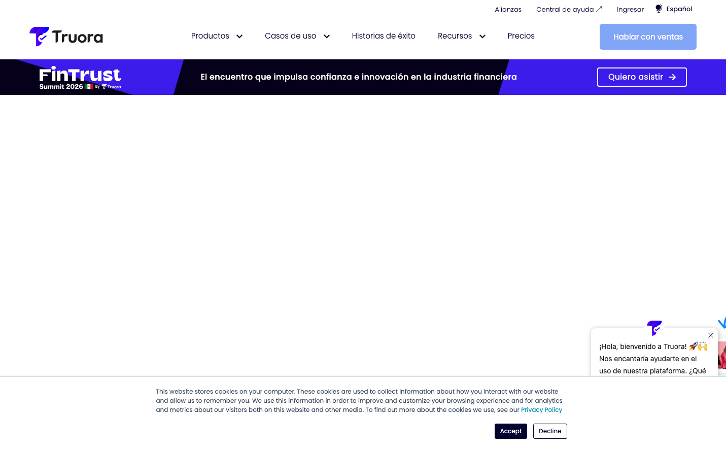
IdentityTruora embodies fintech sophistication through its electric purple-to-blue gradient hero that commands immediate attention against pristine white backgrounds. The Poppins typography creates an approachable yet authoritative voice that bridges corporate trust with modern innovation.
Design Identity
Signature Color
Truora Electric Purple
#6366f1
financial innovation and digital trust - the color of secure transformation
Visual Identity
The dramatic purple-to-blue gradient hero section that spans the full viewport width, creating an electric energy that immediately signals fintech innovation before any content is read.
Component Style
Clean, rounded components with generous padding and subtle shadows. Buttons feature 8px border radius with bold typography, cards have gentle elevation, and the overall feel is polished but accessible - never intimidating.
Spacing Philosophy
Generous whitespace creates breathing room between sections, with the gradient hero taking commanding 40% of viewport height. Internal component padding is comfortable at 16-24px, establishing trust through spatial confidence.
Design Principles
- Purple gradients dominate hero sections for immediate brand recognition
- Poppins typography exclusively at 12px-32px range maintains consistency
- Border radius consistently 8px across all interactive elements
- White backgrounds with #f9fafe subtle gray tints for depth
- 1s animation duration for all transitions creates smooth interactions
Target Audience
Latin American financial institutions and fintech startups seeking enterprise-grade identity verification solutions with a modern, trustworthy partner
Mood
Design descriptions are AI-generated based on visual analysis and may not fully reflect the brand's official design guidelines.
Design System
Typography Scale
| Element | Font | Size | Weight | Line Height |
|---|---|---|---|---|
| body | 16px | 400 | 18.4px | |
| h1 | 32px | 700 | 36.8px | |
| h2 | 24px | 700 | 27.6px | |
| h3 | 18px | 500 | 20.7px | |
| h4 | 16px | 500 | 18.4px | |
| p | 12px | 400 | 18px | |
| a | 12px | 400 | 18px | |
| nav | 16px | 400 | 18.4px | |
| header | 16px | 400 | 18.4px | |
| footer | 16px | 400 | 18.4px |
Color Palette
#f9fafe#007aff