Help us build this. Leave comments, suggest improvements, and help create better design documentation for agents.
Tumi
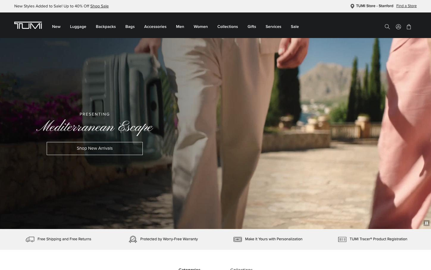
LuxuryTumi's brand identity embodies sophisticated luxury travel through cinematic storytelling and experiential design. The warm, Mediterranean-inspired palette evokes wanderlust and premium lifestyle aspirations, while the elegant script typography creates an intimate, personalized connection with discerning travelers.
Design Identity
Signature Color
Tumi Obsidian
#1b1c1e
premium luxury authority and professional sophistication
Visual Identity
Cinematic hero imagery with elegant script overlays and minimal geometric containers - creating a magazine-editorial aesthetic that feels more like luxury lifestyle content than traditional e-commerce
Component Style
Clean rectangular containers with subtle borders and minimal shadows. Buttons are understated with crisp edges and refined typography. Everything feels weightless yet substantial - luxury without ostentation.
Spacing Philosophy
Generous breathing room around hero content creates premium positioning, while navigation remains compact and functional. The layout prioritizes immersive storytelling over information density.
Design Principles
- Typography contrasts light script headlines with regular sans-serif body text
- Hero imagery dominates viewport with minimal UI overlay
- Navigation stays compact at 14px with tight spacing
- Color palette remains predominantly neutral with strategic accent usage
- Buttons use minimal 4px border radius for refined geometry
Target Audience
affluent business travelers and luxury lifestyle enthusiasts who value craftsmanship and experiential design over feature-heavy interfaces
Mood
Design descriptions are AI-generated based on visual analysis and may not fully reflect the brand's official design guidelines.
Design System
Typography Scale
| Element | Font | Size | Weight | Line Height |
|---|---|---|---|---|
| body | 16px | 400 | 20px | |
| h1 | 40px | 300 | 48px | |
| h2 | 14px | 300 | 16.8px | |
| h3 | 14px | 300 | 24px | |
| p | 12px | 400 | 16px | |
| a | 16px | 400 | 20px | |
| button | 14px | 400 | 18px | |
| input | 16px | 400 | 20px | |
| nav | 16px | 400 | 20px | |
| header | 16px | 400 | 20px |
Color Palette
#ffffff#0070d2#008827#00a1e0#cc0000#7ed0ee#1b1c1e#595959#cccccc#f1f1f1#fafafa#007aff