Help us build this. Leave comments, suggest improvements, and help create better design documentation for agents.
Unilever
Consumer GoodsUnilever's digital identity feels deliberately institutional with its serif Times typography creating an editorial, newspaper-like gravitas. The striking electric blue brand mark dominates an otherwise sparse white canvas, suggesting corporate authority balanced with approachable humanity through warm portrait photography.
Design Identity
Signature Color
Unilever Electric Blue
#0000FF
Corporate authority and global trust - a bold primary blue that commands attention while maintaining professional credibility
Visual Identity
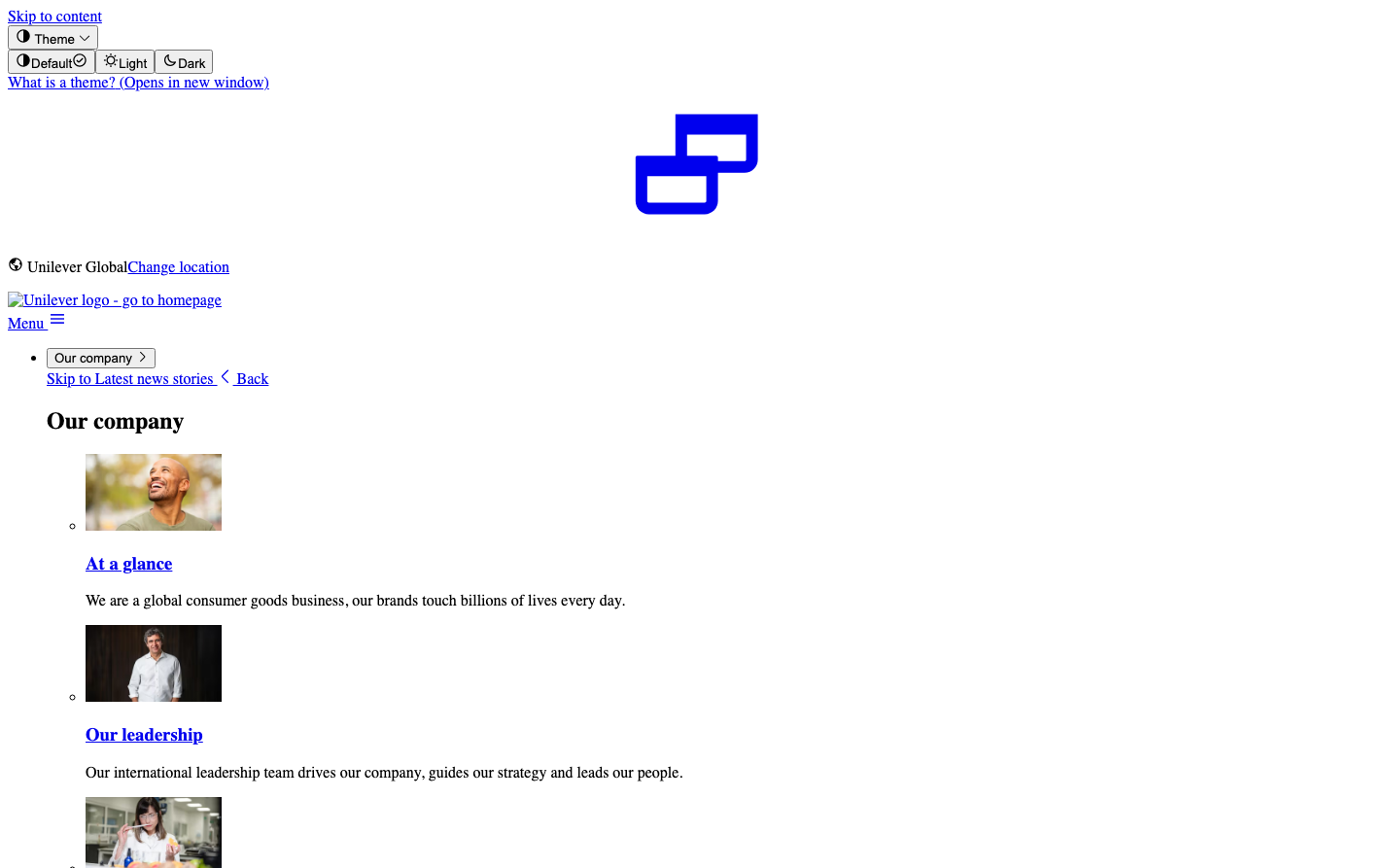
The distinctive interlocking geometric blue logo mark - two rectangular shapes that form a cohesive symbol - instantly recognizable even without the wordmark, creating a strong corporate identifier.
Component Style
Minimal, utilitarian components with sharp corners and clean edges. Navigation elements appear as simple text links without decorative styling. The design prioritizes content over flashy interface elements, feeling more like a corporate document than a modern web experience.
Spacing Philosophy
Generous whitespace dominates the layout with the logo prominently centered and significant breathing room around content blocks. The sparse approach creates focus on key elements while maintaining an uncluttered, executive-level presentation.
Design Principles
- Typography exclusively uses Times serif for content, Arial for interface elements
- Color palette restricted to electric blue (#0000FF) and black text on white
- Portrait photography features genuine, approachable human expressions
- Logo maintains prominent central positioning with ample surrounding space
- Interface elements remain functionally minimal without decorative flourishes
Target Audience
Corporate stakeholders, investors, and business professionals who value substance over style - people seeking authoritative information about a global consumer goods corporation
Mood
Design descriptions are AI-generated based on visual analysis and may not fully reflect the brand's official design guidelines.
Design System
Typography Scale
| Element | Font | Size | Weight | Line Height |
|---|---|---|---|---|
| body | 16px | 400 | normal | |
| h1 | 32px | 700 | normal | |
| h2 | 24px | 700 | normal | |
| h3 | 18.72px | 700 | normal | |
| p | 16px | 400 | normal | |
| a | 16px | 400 | normal | |
| button | 13.3333px | 400 | normal | |
| input | 13.3333px | 400 | normal | |
| nav | 16px | 400 | normal | |
| header | 16px | 400 | normal |
Color Palette
No colors extracted