Help us build this. Leave comments, suggest improvements, and help create better design documentation for agents.
Uniqlo
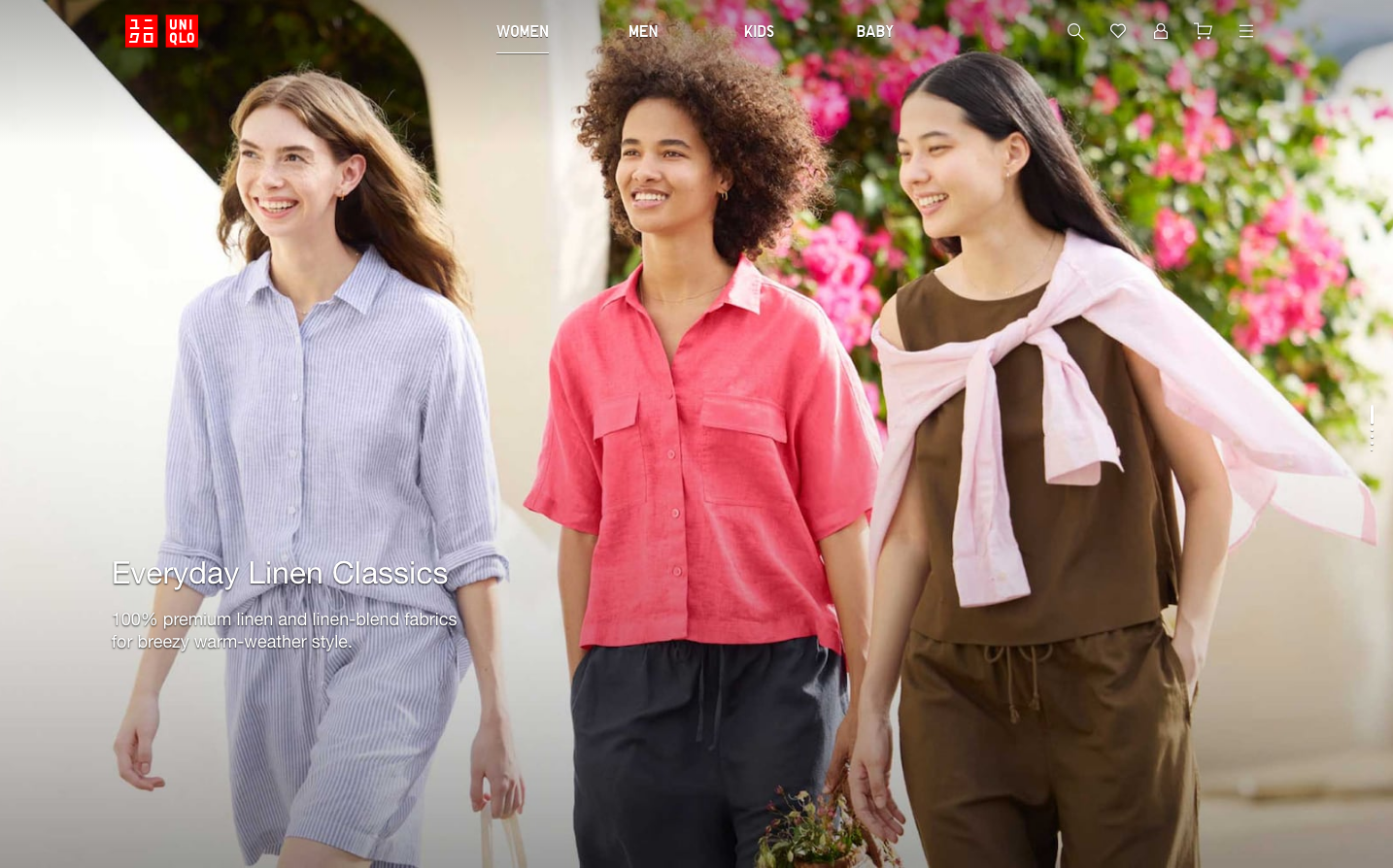
FashionUniqlo embodies accessible minimalism through its signature red logo against pristine white backgrounds, creating an atmosphere of democratic luxury. The brand uses subtle grayscale foundations punctuated by strategic color moments, telling a story of effortless simplicity that makes quality fashion approachable to everyone.
Design Identity
Signature Color
Uniqlo Red
#FF0000
democratic accessibility - making quality fashion simple and attainable for all
Visual Identity
The distinctive red square logo with white serif lettering creates instant recognition, combined with photography that feels like natural documentary moments rather than staged fashion shoots.
Component Style
Clean geometric elements with minimal shadows and subtle borders. Components feel weightless and unobtrusive - 4px border radius maximum, thin 1px borders in #dadada, generous white space, and typography that never competes with the product imagery.
Spacing Philosophy
Generous breathing room with systematic 12px base units scaling to 16px and 20px. The layout feels uncluttered and democratic - everyone can navigate it easily without feeling overwhelmed by density.
Design Principles
- Border radius never exceeds 4px to maintain geometric clarity
- Typography uses system fonts for universal accessibility
- Color palette stays neutral (grays) except for brand red accent
- Transitions are quick and subtle (150ms-300ms) to feel responsive
- Text hierarchy uses only necessary weights: 400 and 700
Target Audience
Conscious consumers aged 25-45 who value quality basics over trend-driven fashion and prefer understated style that works across all life contexts
Mood
Design descriptions are AI-generated based on visual analysis and may not fully reflect the brand's official design guidelines.
Design System
Typography Scale
| Element | Font | Size | Weight | Line Height |
|---|---|---|---|---|
| body | 16px | 400 | normal | |
| h1 | 32px | 700 | normal | |
| h3 | 26px | 400 | 31.2px | |
| p | 32px | 400 | 38.4px | |
| a | 16px | 400 | normal | |
| button | 13.3333px | 400 | normal | |
| input | 16px | 400 | normal | |
| nav | 16px | 400 | normal | |
| header | 16px | 400 | normal | |
| footer | 16px | 400 | normal |
Color Palette
#000000#2a2a2a#005db5#006ed7#767676#5d5d5d#dadada#ee0000#dd3535#6a6a6a#ef5555#ee3535