Help us build this. Leave comments, suggest improvements, and help create better design documentation for agents.
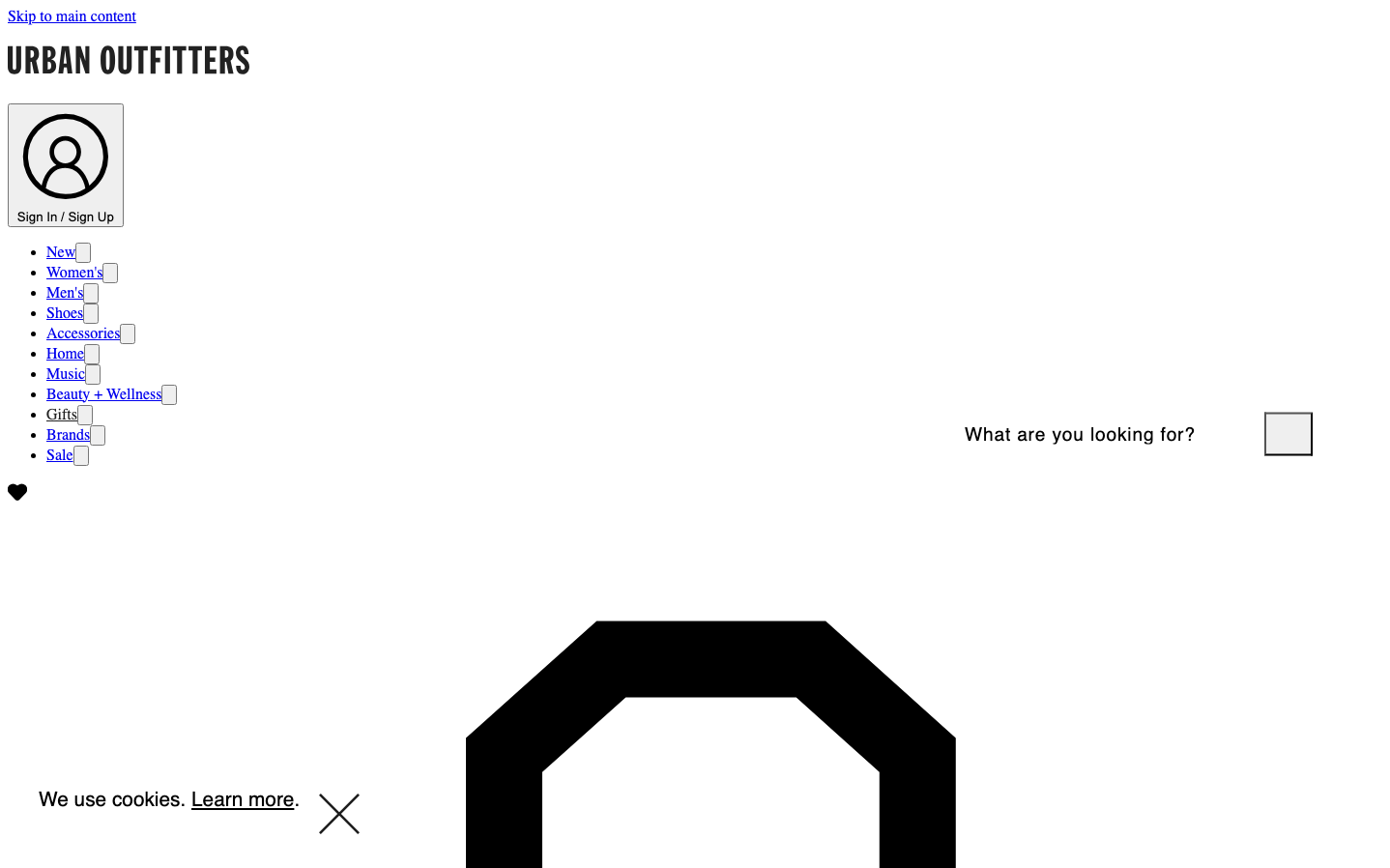
Urban Outfitters
FashionUrban Outfitters employs a stark, institutional aesthetic that feels deliberately anti-fashion, using Times serif for body text against clinical white space. The monochromatic palette and brutal simplicity create an unexpectedly cerebral mood for a fashion retailer, suggesting counter-culture sophistication over mainstream appeal.
Design Identity
Signature Color
Institutional Black
#000000
Counter-cultural authenticity and editorial seriousness that rejects flashy retail conventions
Visual Identity
The jarring mix of Times serif body text with sans-serif navigation creates a magazine-editorial hybrid that's immediately recognizable - like a cultural publication masquerading as e-commerce.
Component Style
Brutally minimal components with sharp corners and no visual embellishments - buttons and inputs rely purely on typography hierarchy rather than color or shadow treatments, creating an almost academic interface.
Spacing Philosophy
Generous white space dominates the layout with institutional breathing room, while navigation elements cluster tightly together, creating tension between editorial spaciousness and utilitarian density.
Design Principles
- Typography mixing is intentional: Times for content, Helvetica/Arial for UI
- Zero decorative elements - no gradients, shadows, or ornamental borders
- Monochromatic palette with black text on white background only
- Font sizes jump dramatically: 13px buttons to 32px headlines
- Line heights vary wildly to create visual rhythm disruption
Target Audience
Art school students and creative professionals who view mainstream fashion retail as inauthentic and prefer brands that signal intellectual credibility over commercial polish
Mood
Design descriptions are AI-generated based on visual analysis and may not fully reflect the brand's official design guidelines.
Design System
Typography Scale
| Element | Font | Size | Weight | Line Height |
|---|---|---|---|---|
| body | 16px | 400 | normal | |
| h1 | 32px | 700 | normal | |
| h2 | 25.6px | 400 | 35.84px | |
| h3 | 19.2px | 400 | 30.72px | |
| p | 16px | 400 | normal | |
| a | 20.8px | 400 | 18px | |
| button | 13.3333px | 400 | normal | |
| input | 19.2px | 400 | 26.88px | |
| nav | 16px | 400 | normal | |
| header | 16px | 400 | normal |
Color Palette
No colors extracted