Help us build this. Leave comments, suggest improvements, and help create better design documentation for agents.
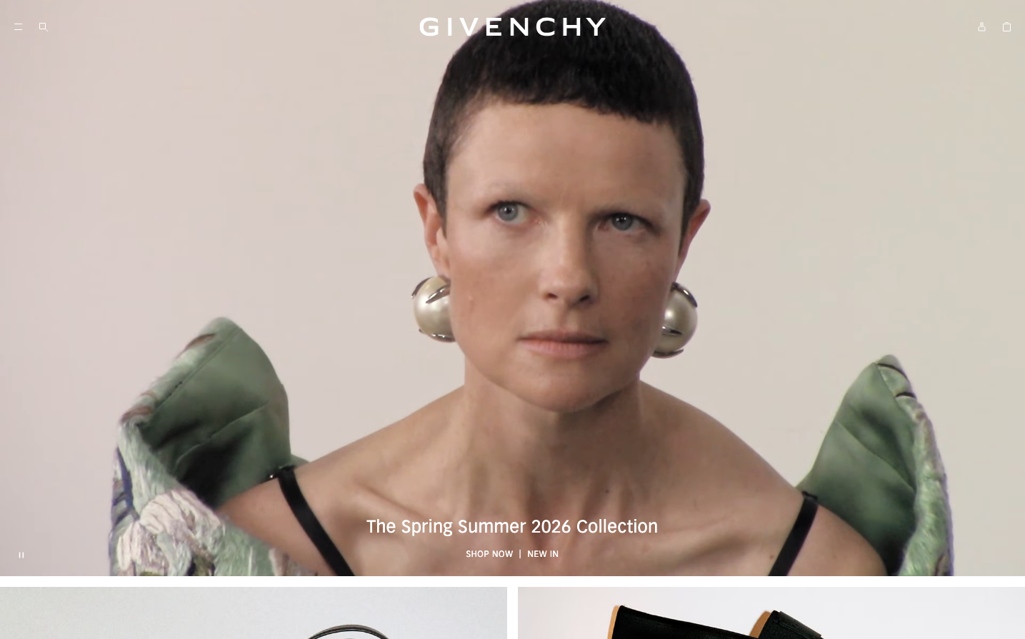
Valentino
LuxuryValentino's digital identity embodies haute couture minimalism through stark black-and-white contrasts and the refined juxtaposition of classical Times New Roman headlines with contemporary DINPro body text. The design whispers luxury through restraint, using pure monochrome to let content breathe with editorial sophistication.
Design Identity
Signature Color
Valentino Black
#000000
Timeless luxury and editorial sophistication - the absence of color as the ultimate statement of confidence
Visual Identity
The marriage of Times New Roman headlines with DINPro body text creates an unmistakable editorial luxury aesthetic - like reading Vogue meets a modern art gallery catalog.
Component Style
Minimal black-and-white components with clean edges and subtle typography hierarchies. Elements feel weightless and sophisticated, likely with minimal borders and generous whitespace rather than heavy shadows or decorative treatments.
Spacing Philosophy
Editorial breathing room with generous margins that mirror high-fashion magazine layouts. Space is used as a luxury element itself, allowing each piece of content to command attention through isolation rather than density.
Design Principles
- Typography mixing: Classical Times New Roman for headlines, modern DINPro for interface elements
- Monochrome palette: Pure black (#000000) on pure white (#ffffff) only
- Font weights stay light: Maximum 500 weight, mostly 400 for elegant restraint
- Subtle transitions: 200ms timing for refined interactions
- Editorial hierarchy: 24px headlines, 14px body, 12px inputs for magazine-like scaling
Target Audience
Ultra-high-net-worth luxury consumers who appreciate understated sophistication over flashy branding - collectors, art patrons, and fashion insiders who value craft and heritage
Mood
Design descriptions are AI-generated based on visual analysis and may not fully reflect the brand's official design guidelines.
Design System
Typography Scale
| Element | Font | Size | Weight | Line Height |
|---|---|---|---|---|
| body | 14px | 400 | 18.998px | |
| h2 | 20px | 400 | 24px | |
| h3 | 24px | 400 | 24px | |
| p | 14px | 400 | 18.998px | |
| a | 14px | 400 | 18.998px | |
| button | 14px | 400 | 18px | |
| input | 12px | 500 | normal | |
| header | 14px | 400 | 18.998px | |
| footer | 14px | 400 | 18.998px | |
| main | 14px | 400 | 18.998px |
Color Palette
#000000#ffffff