Help us build this. Leave comments, suggest improvements, and help create better design documentation for agents.
Vivino
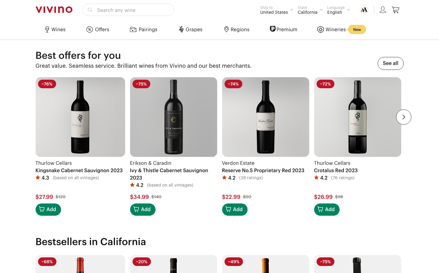
FoodVivino creates a sophisticated wine marketplace through rich burgundy branding and generous card-based layouts. The design balances premium wine culture with approachable e-commerce, using warm earth tones and substantial visual hierarchy that makes wine discovery feel both authoritative and inviting.
Design Identity
Signature Color
Vivino Burgundy
#ba1628
wine heritage and premium marketplace authority
Visual Identity
Distinctive red percentage discount badges positioned as overlays on clean product cards with substantial padding and wine bottle photography against neutral backgrounds
Component Style
Rounded buttons with moderate 6-8px radius, no harsh shadows but subtle borders. Cards have generous padding with clean separation lines. Everything feels substantial but not heavy - wine-cellar sophistication meets modern e-commerce.
Spacing Philosophy
Generous 32-48px gaps between product cards create breathing room that lets wine bottles be the hero. Tight 8-12px internal spacing keeps information digestible while 24px+ margins prevent crowding.
Design Principles
- Border radius stays between 6-12px for approachable but premium feel
- Typography uses only GraphikWeb at 13px body, 16px buttons, 18px descriptions
- Star ratings always use warm amber/orange gradient (#fbcf4e to #8e041a)
- Product cards maintain 4:5 aspect ratio with consistent bottle positioning
- Discount badges use high-contrast red with white text for maximum visibility
Target Audience
Wine enthusiasts and casual drinkers aged 28-55 who value expert recommendations but want accessible pricing and straightforward purchasing
Mood
Design descriptions are AI-generated based on visual analysis and may not fully reflect the brand's official design guidelines.
Design System
Typography Scale
| Element | Font | Size | Weight | Line Height |
|---|---|---|---|---|
| body | 13px | 400 | 20px | |
| h1 | 26px | 500 | 28.6px | |
| h2 | 32px | 500 | 40px | |
| p | 18px | 400 | 28px | |
| a | 13px | 400 | 20px | |
| button | 16px | 500 | 24px | |
| input | 16px | 400 | 24px | |
| nav | 13px | 400 | 20px | |
| footer | 13px | 400 | 20px |
Color Palette
#f0f0f0#ffffff#ffebda#007ac4#575757#757575#d54409#ee803e#b98c04#1e1e1e#fd7907#00845f


