Help us build this. Leave comments, suggest improvements, and help create better design documentation for agents.
VNPay
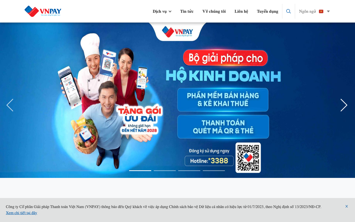
FintechVNPay creates a vibrant, approachable fintech experience through bold red accents against deep blue gradients. The brand balances professional reliability with consumer friendliness, using rounded corners and friendly imagery to make digital payments feel welcoming rather than intimidating.
Design Identity
Signature Color
VNPay Red
#E53E3E
Trust and energy in financial services - conveying both security and action
Visual Identity
Distinctive red pill-shaped call-to-action buttons with generous padding that create strong visual anchors against gradient blue backgrounds, combined with approachable human-centered photography
Component Style
Soft rounded corners (16-24px radius) with bold red primary buttons that feel substantial and clickable. Cards have gentle shadows and blue gradient treatments. Everything feels tactile and consumer-friendly rather than corporate.
Spacing Philosophy
Generous whitespace creates breathing room between major sections, while compact internal padding keeps content digestible. The layout prioritizes visual hierarchy through strategic spacing rather than cramped efficiency.
Design Principles
- Primary buttons use 24px+ border radius for pill-like appearance
- Red (#E53E3E) is reserved for primary actions only
- Blue gradients provide background depth without overwhelming content
- Typography mixes Inter for readability with system fonts for UI elements
- Human photography always shows multiple people to convey community
Target Audience
Vietnamese consumers and small business owners who want accessible digital payment solutions without technical complexity
Mood
Design descriptions are AI-generated based on visual analysis and may not fully reflect the brand's official design guidelines.
Design System
Typography Scale
| Element | Font | Size | Weight | Line Height |
|---|---|---|---|---|
| body | 16px | 400 | normal | |
| h1 | 14px | 700 | 22px | |
| h2 | 14px | 700 | 22px | |
| h3 | 25px | 600 | normal | |
| p | 42px | 600 | 50px | |
| a | 14px | 400 | 13px | |
| button | 13.3333px | 400 | normal | |
| nav | 14px | 400 | 80px | |
| header | 14px | 400 | 80px | |
| footer | 14px | 400 | 22px |
Color Palette
No colors extracted