Help us build this. Leave comments, suggest improvements, and help create better design documentation for agents.
Walmart
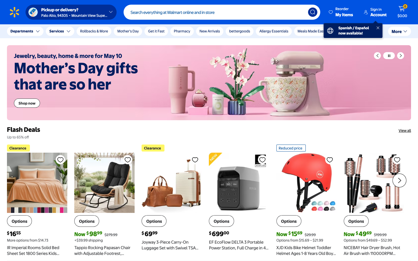
RetailWalmart's digital identity balances mass-market accessibility with surprising sophistication through bold blue anchors and warm pink accents. The EverydaySans typography creates approachable familiarity while maintaining retail authority, evoking trust through democratic design that feels both dependable and contemporary.
Design Identity
Signature Color
Walmart Blue
#0071ce
democratic accessibility and retail authority - the blue of everyday America
Visual Identity
The distinctive pink-to-white gradient hero sections combined with EverydaySans typography creates an instantly recognizable 'friendly retail giant' aesthetic that balances warmth with corporate scale.
Component Style
Rounded corners with 6-8px radius, flat UI with minimal shadows, bold weight contrasts, and generous padding. Components feel substantial but approachable - like friendly retail fixtures rather than sterile tech interfaces.
Spacing Philosophy
Generous hero sections with tight, efficient product grids below. Large breathing room for marketing messages, dense utilitarian spacing for commerce functionality - mirroring physical store layouts.
Design Principles
- Pink gradient heroes for seasonal campaigns, blue for permanent navigation
- EverydaySans at 16px base with bold 700 weight for headings
- White product cards with subtle borders, never harsh shadows
- Horizontal navigation bars with ample 16-24px padding
- Price typography always bold and prominent
Target Audience
Budget-conscious families and mainstream American shoppers who value convenience and savings over premium aesthetics
Mood
Design descriptions are AI-generated based on visual analysis and may not fully reflect the brand's official design guidelines.
Design System
Typography Scale
| Element | Font | Size | Weight | Line Height |
|---|---|---|---|---|
| body | 16px | 400 | normal | |
| h1 | 32px | 700 | normal | |
| h2 | 24px | 700 | 30px | |
| h3 | 14px | 400 | 17.5px | |
| p | 22px | 700 | 24.2px | |
| a | 16px | 400 | normal | |
| button | 16px | 400 | 18.4px | |
| input | 16px | 400 | 16px | |
| nav | 16px | 400 | normal | |
| header | 16px | 400 | normal |
Color Palette
#b1267d#515357#8c1e64#fffcf4#e587ba#a3dbe9#001e60#002e99#babbbe#ffffff#63327e#452358