Help us build this. Leave comments, suggest improvements, and help create better design documentation for agents.
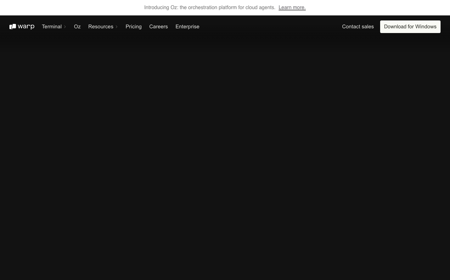
Warp
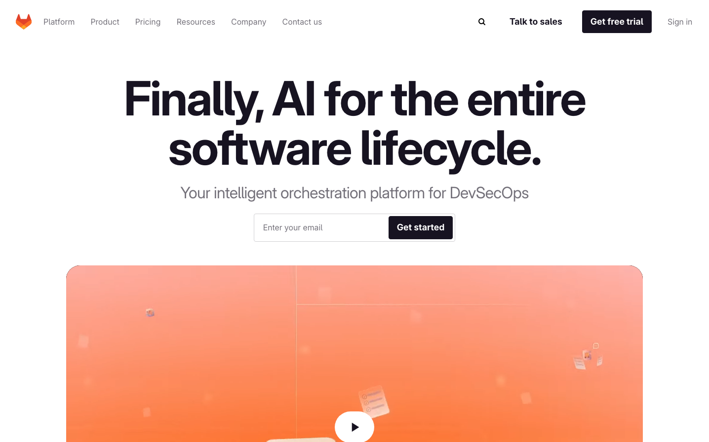
Dev ToolsWarp embodies a sophisticated developer-first aesthetic with extreme minimalism and nocturnal elegance. The nearly black interface creates an intense, focused environment that feels like a high-end code editor transformed into a product experience, using surgical precision in typography and stark contrast to communicate professional depth.
Design Identity
Signature Color
Warp Carbon
#1a1a1a
developer-focused intensity and professional depth
Visual Identity
The signature characteristic is the extreme dark minimalism with strategic use of negative space - creating an almost void-like canvas that makes any content feel deliberately placed and important, like a premium code editor interface.
Component Style
Ultra-minimal components with sharp, clean edges and no visible shadows or heavy borders. Everything feels weightless and precise, with subtle contrast differences rather than heavy visual treatments - buttons and interactive elements blend seamlessly into the dark interface.
Spacing Philosophy
Generous negative space dominates the layout, creating a sense of focus and calm. Large empty areas make the minimal navigation and content feel intentionally sparse, emphasizing quality over quantity in every placement decision.
Design Principles
- Dark backgrounds (#1a1a1a or darker) create the foundation
- Typography uses Matter Regular and Inter exclusively
- Extreme minimalism - show only essential elements
- No decorative shadows or heavy borders
- Strategic use of whitespace over visual density
Target Audience
Senior developers and technical professionals who value craft, performance, and distraction-free interfaces over feature-heavy experiences
Mood
Design descriptions are AI-generated based on visual analysis and may not fully reflect the brand's official design guidelines.
Design System
Typography Scale
| Element | Font | Size | Weight | Line Height |
|---|---|---|---|---|
| body | 12px | 400 | normal | |
| h1 | 40px | 400 | 46px | |
| h2 | 14px | 400 | 18.2px | |
| h5 | 24px | 400 | 26.4px | |
| p | 16px | 400 | 19.2px | |
| a | 16px | 400 | 19.2px | |
| button | 12px | 400 | normal | |
| input | 16px | 400 | 19.2px | |
| nav | 12px | 400 | normal | |
| footer | 12px | 400 | normal |
Color Palette
No colors extracted