Help us build this. Leave comments, suggest improvements, and help create better design documentation for agents.
Wealthsimple
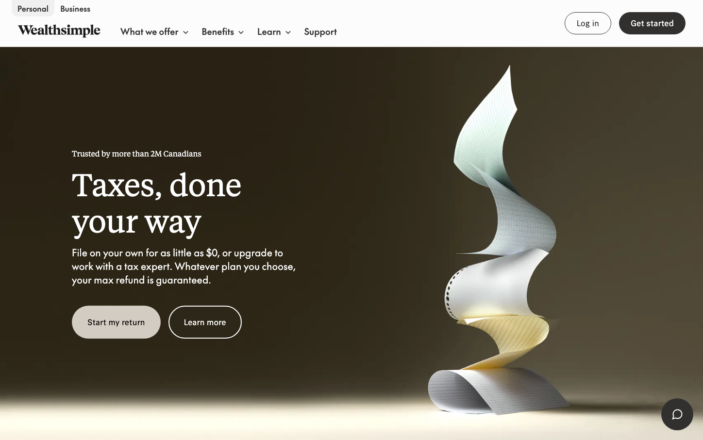
FintechWealthsimple embodies sophisticated minimalism through warm earth tones and elegant typography contrasts. The rich chocolate background paired with flowing sculptural elements creates an atmosphere of premium financial craftsmanship, while the serif-sans font pairing suggests both heritage trust and modern innovation.
Design Identity
Signature Color
Wealthsimple Charcoal
#32302f
sophisticated financial authority with approachable warmth
Visual Identity
The flowing, ribbon-like sculptural element that creates organic movement against stark geometric layouts - a signature blend of mathematical precision with human-centered warmth.
Component Style
Pill-shaped buttons with 1000px border radius create soft, approachable touchpoints. Components feel substantial yet gentle, with no harsh shadows - everything relies on subtle color contrast and generous padding for definition.
Spacing Philosophy
Luxurious breathing room with asymmetrical layouts that feel naturally composed rather than grid-locked. Large gaps between sections create contemplative pauses, while content clusters feel intimate and focused.
Design Principles
- Buttons use 1000px border radius for perfect pill shapes
- Typography mixes 'tiempos' serif for headlines with 'the-future' sans for UI
- Earth tone palette never exceeds 5 colors per composition
- Text sizes jump dramatically: 16px body to 64px+ headlines
- No drop shadows - all depth through color and spacing
Target Audience
Millennial professionals who value thoughtful design over flashy features - people who see money management as lifestyle curation rather than spreadsheet optimization.
Mood
Design descriptions are AI-generated based on visual analysis and may not fully reflect the brand's official design guidelines.
Design System
Typography Scale
| Element | Font | Size | Weight | Line Height |
|---|---|---|---|---|
| body | 18px | 400 | 25.2px | |
| h1 | 84px | 400 | 97.44px | |
| h2 | 64px | 400 | 74.24px | |
| h3 | 16px | 400 | 19.84px | |
| p | 16px | 400 | 19.84px | |
| a | 16px | 400 | normal | |
| button | 18px | 500 | 20.88px | |
| input | 18px | 400 | 25.2px | |
| nav | 18px | 400 | 25.2px | |
| header | 18px | 400 | 25.2px |
Color Palette
#fcfcfc#e4e2e1#32302f#686664#486635#a43d12#afaaa7#ffffff#f1f0f0#f8f8f8#c9c6c4#94908d


