Help us build this. Leave comments, suggest improvements, and help create better design documentation for agents.
Wendy's
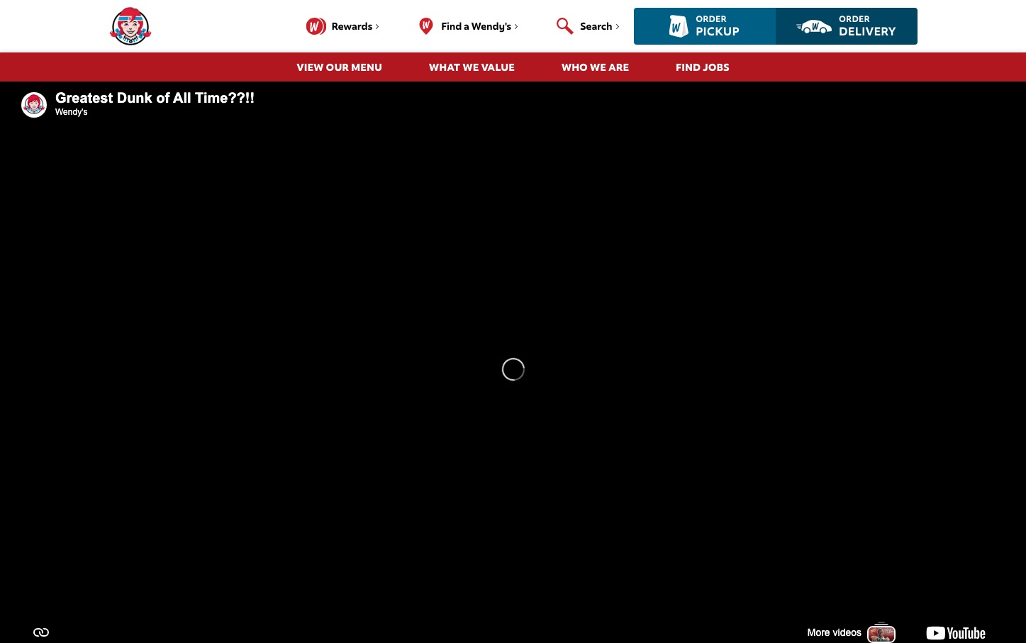
FoodWendy's creates a bold, irreverent fast-food experience that blends playful rebellion with confident Americana. The signature red dominates with aggressive energy, while the custom 'WendysFresh' typography reinforces brand ownership and casual authenticity against clean, utilitarian layouts.
Design Identity
Signature Color
Wendy's Red
#DA020E
Bold appetite stimulation and confident fast-food dominance
Visual Identity
The aggressive use of Wendy's signature red in large blocks combined with the distinctive 'WendysFresh' custom typography creates an unmistakable brand presence that feels both playful and assertive.
Component Style
Clean, rectangular buttons with sharp corners and solid fills. The red navigation bar creates strong horizontal division, while white text maintains high contrast. No visible shadows or ornamental effects - everything feels direct and functional.
Spacing Philosophy
Efficient, compact spacing that prioritizes content density over luxury breathing room. The red header bar creates immediate visual impact while the main content area uses minimal padding to maximize screen real estate.
Design Principles
- Red signature color dominates navigation and key interactive elements
- Custom 'WendysFresh' font exclusively for headlines and buttons at 700 weight
- Roboto provides clean readability for body content and secondary elements
- Sharp, rectangular components with no border radius
- High contrast white text on red backgrounds for maximum legibility
Target Audience
Fast-food consumers who appreciate bold, no-nonsense branding and value quick, efficient digital experiences over premium aesthetics
Mood
Design descriptions are AI-generated based on visual analysis and may not fully reflect the brand's official design guidelines.
Design System
Typography Scale
| Element | Font | Size | Weight | Line Height |
|---|---|---|---|---|
| body | 10px | 400 | normal | |
| h1 | 60px | 700 | 67.5px | |
| h2 | 15px | 700 | normal | |
| h3 | 13px | 700 | normal | |
| p | 10px | 400 | normal | |
| a | 16px | 400 | 26px | |
| button | 12px | 700 | normal | |
| nav | 10px | 400 | normal | |
| header | 10px | 400 | normal | |
| footer | 10px | 400 | normal |
Color Palette
No colors extracted


