Help us build this. Leave comments, suggest improvements, and help create better design documentation for agents.
Woowa Bros
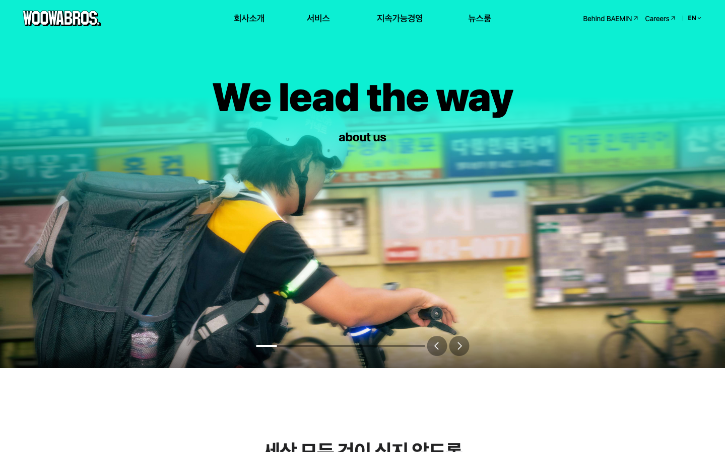
FoodWoowa Bros creates a vibrant, kinetic brand identity that captures the urgency and motion of food delivery through electric turquoise gradients and bold impact typography. The aesthetic radiates youthful energy and street-level hustle, positioning delivery workers as urban heroes in motion.
Design Identity
Signature Color
Electric Turquoise
#00E6CC
High-energy delivery momentum and digital-first food tech innovation
Visual Identity
The electric turquoise-to-teal gradient overlay creates an unmistakable neon-lit, motion-blur aesthetic that makes every image feel like it's captured mid-delivery rush.
Component Style
Clean, borderless elements with subtle shadows float over the vibrant gradient backgrounds. Navigation and interactive elements maintain crisp edges with generous hit targets, prioritizing mobile-first usability for drivers and customers on-the-go.
Spacing Philosophy
Generous vertical breathing room allows the dramatic gradient backgrounds to dominate, while tight 8px micro-spacing keeps functional elements compact for mobile efficiency.
Design Principles
- Typography uses only Pretendard Variable across all elements for Korean-optimized consistency
- Hero text scales to 40px/700 weight for maximum street-level impact
- Motion blur and gradient overlays never exceed 70% opacity to maintain readability
- Navigation stays minimal at 16px regular weight to not compete with hero messaging
- All interactive elements sized for thumb-friendly mobile delivery app usage
Target Audience
Urban millennials and Gen Z consumers who value speed and convenience, plus gig economy delivery workers who need efficient, mobile-optimized tools
Mood
Design descriptions are AI-generated based on visual analysis and may not fully reflect the brand's official design guidelines.
Design System
Typography Scale
| Element | Font | Size | Weight | Line Height |
|---|---|---|---|---|
| body | 16px | 400 | 24px | |
| h1 | 16px | 400 | 24px | |
| h2 | 18px | 400 | 27px | |
| h3 | 40px | 700 | 52px | |
| p | 20px | 700 | 32px | |
| a | 16px | 400 | 24px | |
| button | 18px | 500 | 27px | |
| nav | 16px | 400 | 24px | |
| header | 16px | 400 | 24px | |
| footer | 14px | 400 | 21px |
Color Palette
#ffffff


