Help us build this. Leave comments, suggest improvements, and help create better design documentation for agents.
Wren
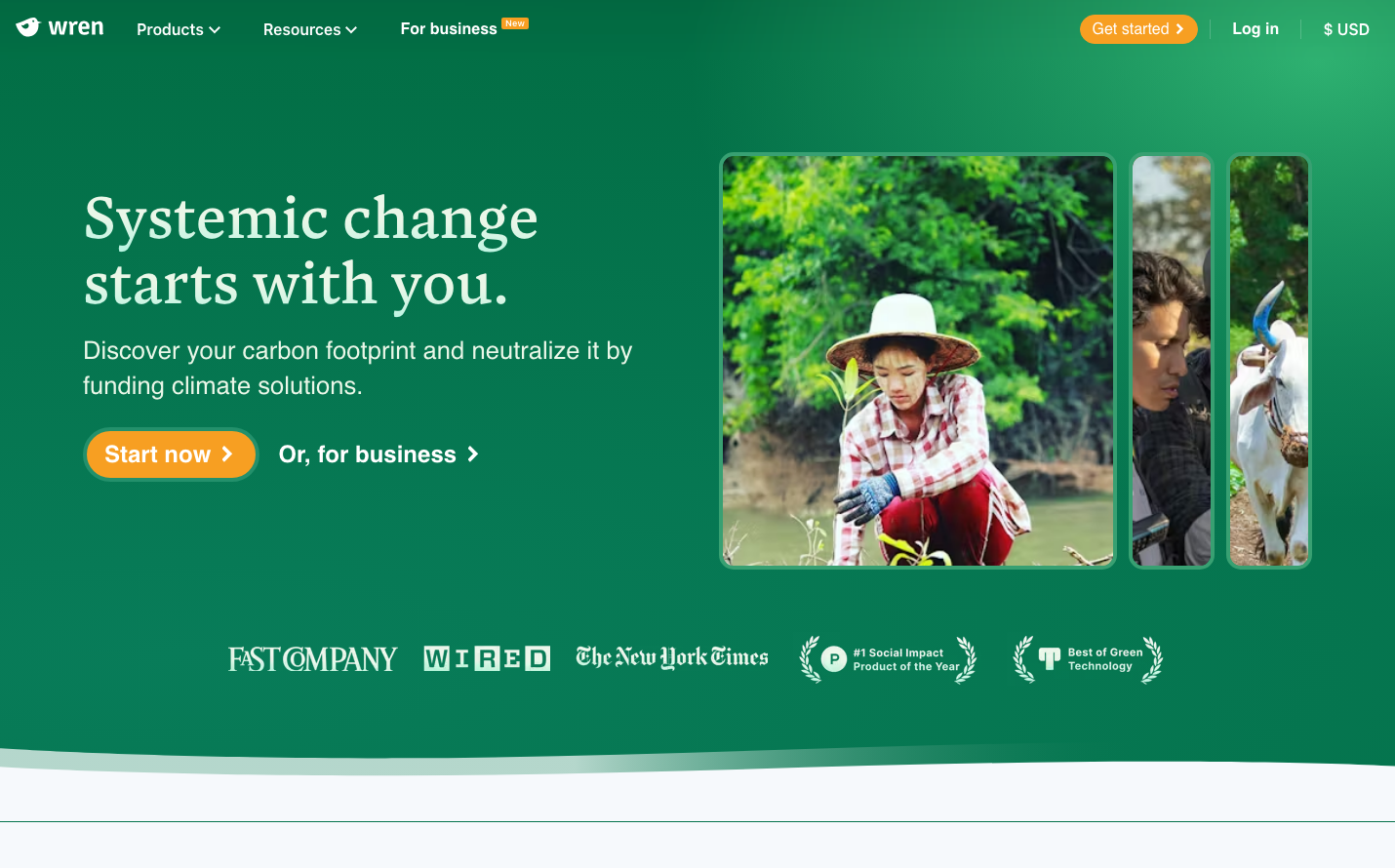
Climate TechWren's brand radiates earth-conscious optimism through its rich forest green backdrop and warm orange accents, creating an atmosphere of environmental activism meets accessible action. The elegant Blanco serif headlines paired with clean Inter body text communicate both gravitas and approachability - serious about climate change but welcoming to everyday people.
Design Identity
Signature Color
Forest Impact Green
#1B7F5A
Environmental commitment and growth - the color of thriving forests and meaningful climate action
Visual Identity
The immersive green gradient background that dominates the entire viewport, creating an environmental cocoon that makes users feel wrapped in nature and purpose.
Component Style
Warm, rounded buttons with generous padding and soft shadows - organic shapes that feel human and approachable rather than corporate. The orange primary button has a friendly pill-like quality with substantial 16px+ corner radius.
Spacing Philosophy
Expansive breathing room with the hero content floating in generous whitespace, creating a sense of calm and clarity amidst environmental urgency. Large gaps between sections mirror the vastness of natural spaces.
Design Principles
- Headlines use Blanco serif at 50px for environmental gravitas
- Body text stays at Inter 25.6px for comfortable reading
- Orange accent color only on primary actions to drive conversion
- Green gradient backgrounds create immersive environmental atmosphere
- Button corner radius exceeds 16px for organic, nature-inspired feel
Target Audience
Climate-conscious millennials and Gen Z who want to take meaningful environmental action but need guidance and reassurance that their individual efforts matter
Mood
Design descriptions are AI-generated based on visual analysis and may not fully reflect the brand's official design guidelines.
Design System
Typography Scale
| Element | Font | Size | Weight | Line Height |
|---|---|---|---|---|
| body | 16px | 400 | normal | |
| h1 | 30px | 600 | 36px | |
| h2 | 50px | 600 | 55px | |
| h3 | 18px | 600 | 25.2px | |
| h4 | 22px | 600 | normal | |
| p | 25.6px | 400 | 35.84px | |
| a | 16px | 600 | normal | |
| button | 16px | 600 | 16px | |
| nav | 16px | 400 | normal | |
| body | 16px | 400 | normal |
Color Palette
#cccccc#000000