Help us build this. Leave comments, suggest improvements, and help create better design documentation for agents.
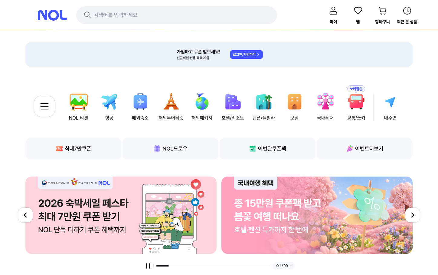
Yanolja
TravelNOL delivers a playful yet sophisticated Korean travel platform aesthetic that balances vibrant iconography with clean minimalism. The design speaks fluent Korean digital culture through rounded, friendly UI elements while maintaining the precision expected from a premium booking platform.
Design Identity
Signature Color
NOL Purple
#6366F1
Korean digital innovation meets global travel aspirations - premium yet approachable
Visual Identity
Distinctive colorful 3D-style icons arranged in a perfect grid, each representing travel categories with consistent rounded rectangular containers and subtle drop shadows
Component Style
Soft rounded corners (12-16px) with gentle drop shadows, creating pillowy button and card treatments. Icons sit in colored circular or rounded square containers with a slight 3D effect, making everything feel touchable and friendly.
Spacing Philosophy
Generous 24px gaps between icon grid items create breathing room, while the overall layout uses tight internal padding (8-12px) to keep components compact and mobile-optimized for Korean users.
Design Principles
- Border radius consistently 12-16px for primary elements
- Icons use saturated colors (orange, blue, green, purple) on white backgrounds
- Typography uses only Pretendard font family across all elements
- Grid layouts with 8-column icon arrangement for desktop
- Promotional banners use gradient overlays on photographic backgrounds
Target Audience
Korean millennials and Gen Z travelers who expect both local cultural familiarity and international travel sophistication
Mood
Design descriptions are AI-generated based on visual analysis and may not fully reflect the brand's official design guidelines.
Design System
Typography Scale
| Element | Font | Size | Weight | Line Height |
|---|---|---|---|---|
| body | 10px | 400 | 15px | |
| h2 | 32px | 700 | 38px | |
| p | 12px | 400 | 14px | |
| a | 10px | 400 | 15px | |
| button | 10px | 700 | 15px | |
| input | 18px | 700 | 22px | |
| nav | 10px | 400 | 15px | |
| header | 10px | 400 | 15px | |
| footer | 10px | 400 | 15px |
Color Palette
#007aff#ffffff