Help us build this. Leave comments, suggest improvements, and help create better design documentation for agents.
Y Combinator
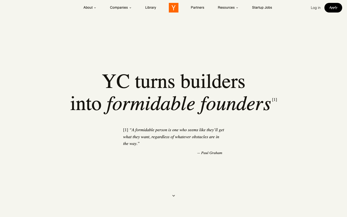
Venture CapitalY Combinator's identity channels intellectual gravitas through stark minimalism - vast cream expanses punctuated by precise black typography create an almost academic atmosphere. The dual typography system (sans-serif Outfit for UI, serif Source Serif 4 for content) signals both technical precision and scholarly depth, positioning YC as the thinking person's accelerator.
Design Identity
Signature Color
YC Orange
#FF6600
Startup energy and Silicon Valley optimism - the one bold accent in an otherwise monochromatic world
Visual Identity
Extreme typographic contrast on cream backgrounds - mixing ultra-light sans-serif with bold serif creates an unmistakable academic-meets-startup aesthetic that no other accelerator attempts
Component Style
Invisible UI with maximum restraint - the black 'Apply' button uses sharp corners and appears to have minimal padding, letting typography do all the heavy lifting. No shadows, no borders, just pure typographic hierarchy.
Spacing Philosophy
Cathedral-like breathing room with the hero message floating in vast cream space, creating an almost reverent atmosphere where every word carries weight. Massive vertical gaps suggest confidence and exclusivity.
Design Principles
- Typography weight varies dramatically - body text at 200 weight, headings jump to 600
- Dual font system: Outfit for UI precision, Source Serif 4 for content authority
- Cream background (#F5F5F0 or similar) creates warmth without being pure white
- Black text maintains maximum contrast and readability
- Orange accent used sparingly for brand recognition only
Target Audience
Ambitious builders and technical founders who value intellectual rigor over flashy marketing - people who appreciate understated confidence and substance over style
Mood
Design descriptions are AI-generated based on visual analysis and may not fully reflect the brand's official design guidelines.
Design System
Typography Scale
| Element | Font | Size | Weight | Line Height |
|---|---|---|---|---|
| body | 16px | 200 | 24px | |
| h2 | 11.2px | 400 | 16.8px | |
| h3 | 16px | 300 | 20.8px | |
| h4 | 18px | 600 | 28px | |
| p | 14px | 300 | 19.6px | |
| a | 16px | 200 | 20px | |
| button | 16px | 200 | 20px | |
| nav | 16px | 200 | 20px | |
| header | 16px | 200 | 20px | |
| footer | 16px | 200 | 24px |
Color Palette
#ffffff#000000