Help us build this. Leave comments, suggest improvements, and help create better design documentation for agents.
Yokoy
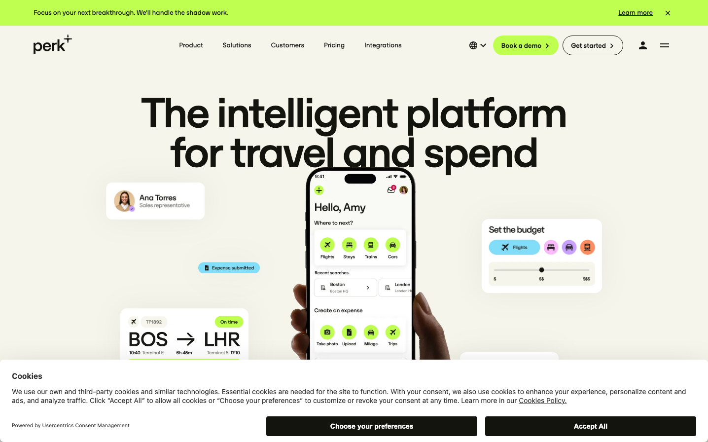
FintechThis brand radiates productivity-focused optimism through its signature lime-green accent that energizes an otherwise neutral palette. The oversized typography creates bold confidence while the mobile-first product showcase demonstrates user-centric thinking, positioning this as an approachable yet sophisticated business tool.
Design Identity
Signature Color
Productivity Lime
#B8FF2B
energetic efficiency and forward-thinking business innovation
Visual Identity
The dramatic scale contrast between massive headline typography and detailed mobile interface mockups, anchored by strategic lime-green accents that guide the eye through the composition.
Component Style
Soft, approachable rounded corners (8-12px) with subtle shadows on floating elements. Buttons feel substantial with generous padding, while mobile UI elements use gentle radius treatments that suggest friendliness over corporate rigidity.
Spacing Philosophy
Expansive whitespace creates breathing room around the central headline, while the mobile interface demonstrates tight, efficient spacing. Large 40-60px gaps separate major sections, creating a sense of premium focus.
Design Principles
- Lime green appears only as strategic accent color, never overwhelming
- Typography scale jumps dramatically - 90px headlines to 16px body with minimal intermediate sizes
- Mobile interfaces show real functionality, not abstract concepts
- Rounded corners consistently 8-12px across all interactive elements
- Neutral backgrounds (cream/off-white) provide calm foundation
Target Audience
Finance teams and expense managers at mid-to-large companies who want powerful functionality without intimidating complexity
Mood
Design descriptions are AI-generated based on visual analysis and may not fully reflect the brand's official design guidelines.
Design System
Typography Scale
| Element | Font | Size | Weight | Line Height |
|---|---|---|---|---|
| body | 16px | 400 | normal | |
| h1 | 90px | 500 | 80px | |
| h2 | 80px | 500 | 72px | |
| h3 | 30px | 500 | 33px | |
| h4 | 18px | 400 | 26.28px | |
| h5 | 16px | 500 | 23.36px | |
| p | 14px | 500 | 20.44px | |
| a | 16px | 400 | normal | |
| button | 13.3333px | 400 | normal | |
| input | 16px | 400 | normal |
Color Palette
No colors extracted