Help us build this. Leave comments, suggest improvements, and help create better design documentation for agents.
Zapier
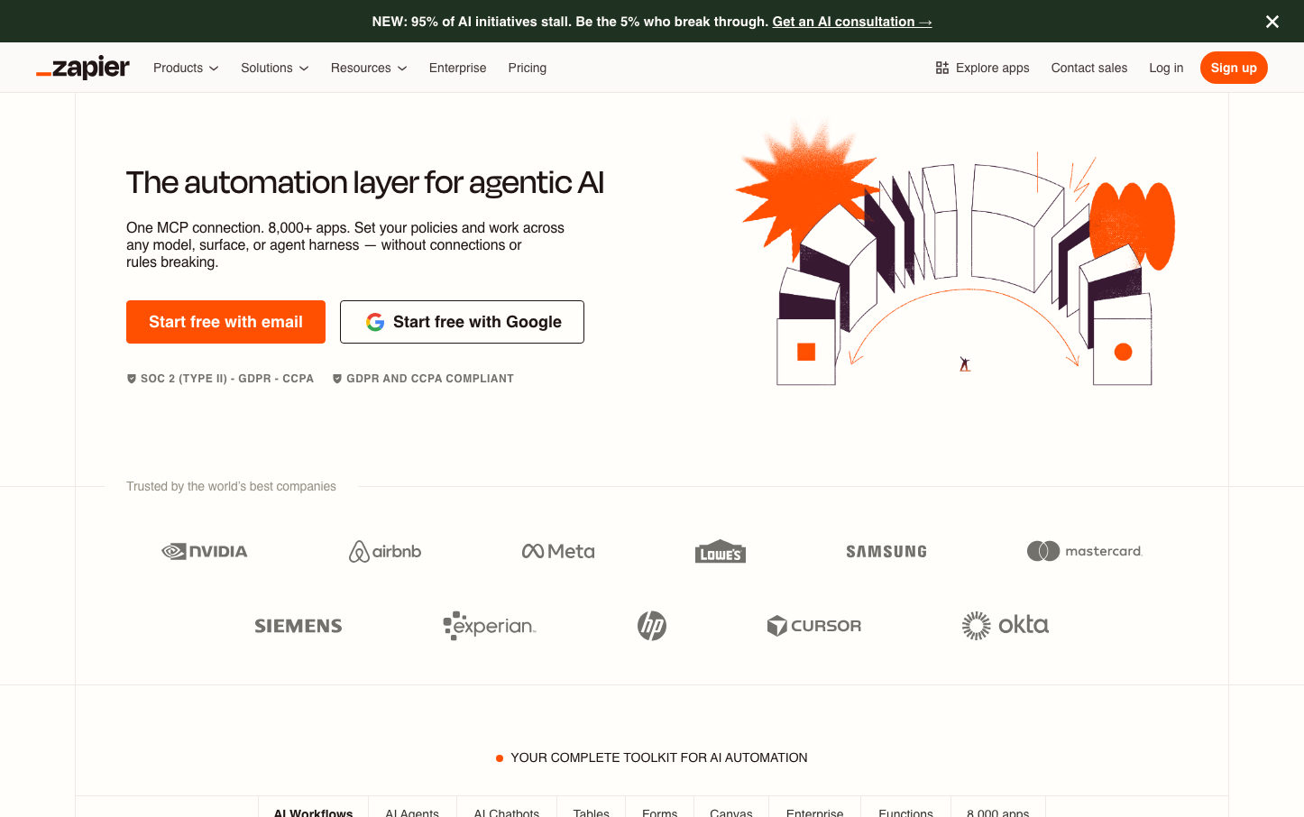
SaaSZapier's brand radiates approachable automation mastery through vibrant orange energy contrasted against soft, cream-colored backgrounds. The playful isometric illustration style transforms complex AI workflows into digestible visual metaphors, while Degular Display typography adds sophisticated warmth that bridges technical capability with human accessibility.
Design Identity
Signature Color
Zapier Flame Orange
#FF4F00
Energetic automation power that ignites workflow possibilities
Visual Identity
Distinctive isometric 3D illustrations with orange accent elements that visualize abstract automation concepts as tangible, interconnected building blocks floating in space.
Component Style
Rounded-corner buttons with substantial padding create friendly approachability. The primary CTA uses bold orange with generous 16px vertical padding, while the secondary Google button maintains clean white backgrounds with subtle borders. Everything feels substantial but not heavy.
Spacing Philosophy
Generous whitespace creates breathing room around key messaging, with the hero illustration taking up significant real estate to establish visual dominance. Tight company logo spacing below suggests efficiency and density where appropriate.
Design Principles
- Orange (#FF4F00) dominates key interaction points and visual accents
- Degular Display headlines at 40px create authoritative but friendly voice
- Cream background (#fbfaf8) provides warm neutrality over stark white
- Isometric illustrations always include orange elements as focal anchors
- Button radius consistently around 4-6px for modern but not overly soft feel
Target Audience
Business operations professionals and citizen developers who want powerful automation without the complexity - people who value getting things done over technical posturing
Mood
Design descriptions are AI-generated based on visual analysis and may not fully reflect the brand's official design guidelines.
Design System
Typography Scale
| Element | Font | Size | Weight | Line Height |
|---|---|---|---|---|
| body | 16px | 400 | normal | |
| h1 | 40px | 500 | 36px | |
| h2 | 14px | 500 | 17.5px | |
| h3 | 24px | 600 | normal | |
| h5 | 14.94px | 700 | 31px | |
| p | 14px | 400 | 16px | |
| a | 14.94px | 700 | 31px | |
| button | 13.3333px | 400 | normal | |
| nav | 16px | 400 | normal | |
| header | 16px | 400 | normal |
Color Palette
#fbfaf8