Help us build this. Leave comments, suggest improvements, and help create better design documentation for agents.
Zylo
SaaS ManagementZylo's brand exudes data-driven confidence through its sophisticated teal-to-orange duotone palette, creating a sense of analytical precision with warmth. The Lufga display typography feels contemporary and approachable, while the dashboard-heavy layout screams enterprise SaaS sophistication.
Design Identity
Signature Color
Zylo Teal
#2A6B6D
Enterprise analytics trust and data depth
Visual Identity
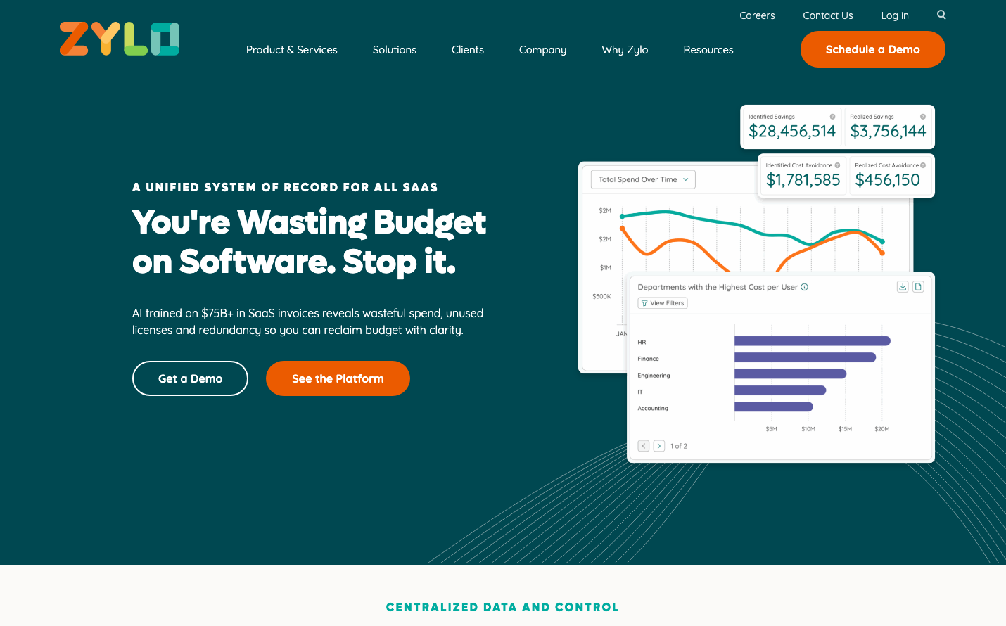
The distinctive analytics dashboard mock-ups with dual-color line graphs (teal/orange) and the specific way financial data is visualized with clear spend metrics - it's unmistakably a SaaS spend management platform.
Component Style
Rounded corners with subtle shadows create approachable professionalism. Buttons have generous pill-shaped borders (24px+ radius), cards use soft drop shadows, and everything feels substantial yet friendly - no sharp edges or stark minimalism.
Spacing Philosophy
Generous 64px+ gaps between major sections create breathing room, while the dashboard mockup uses tight 16px internal spacing to pack maximum data density. It's airy at the macro level, efficient at the micro level.
Design Principles
- Orange (#eb5b00) reserved exclusively for primary actions and key data highlights
- Teal backgrounds create depth without overwhelming content
- Dashboard visualizations always use the signature teal/orange duotone
- Button radius never below 20px - everything feels approachable
- White space ratio of 40/60 content to space for enterprise credibility
Target Audience
SaaS procurement managers and finance executives who need to justify software spend to C-suite leadership
Mood
Design descriptions are AI-generated based on visual analysis and may not fully reflect the brand's official design guidelines.
Design System
Typography Scale
| Element | Font | Size | Weight | Line Height |
|---|---|---|---|---|
| body | 16px | 400 | 16px | |
| h1 | 48px | 400 | 56px | |
| h2 | 40px | 400 | 44px | |
| h3 | 26px | 400 | 32px | |
| h4 | 16px | 400 | 24px | |
| p | 16px | 400 | 24px | |
| a | 16px | 400 | 16px | |
| button | 16px | 700 | 20px | |
| input | 16px | 400 | 16px | |
| nav | 16px | 400 | 16px |
Color Palette
#eb5b00#000000#abb8c3#ffffff#f78da7#cf2e2e#ff6900#fcb900#7bdcb5#00d084#8ed1fc#0693e3