Help us build this. Leave comments, suggest improvements, and help create better design documentation for agents.
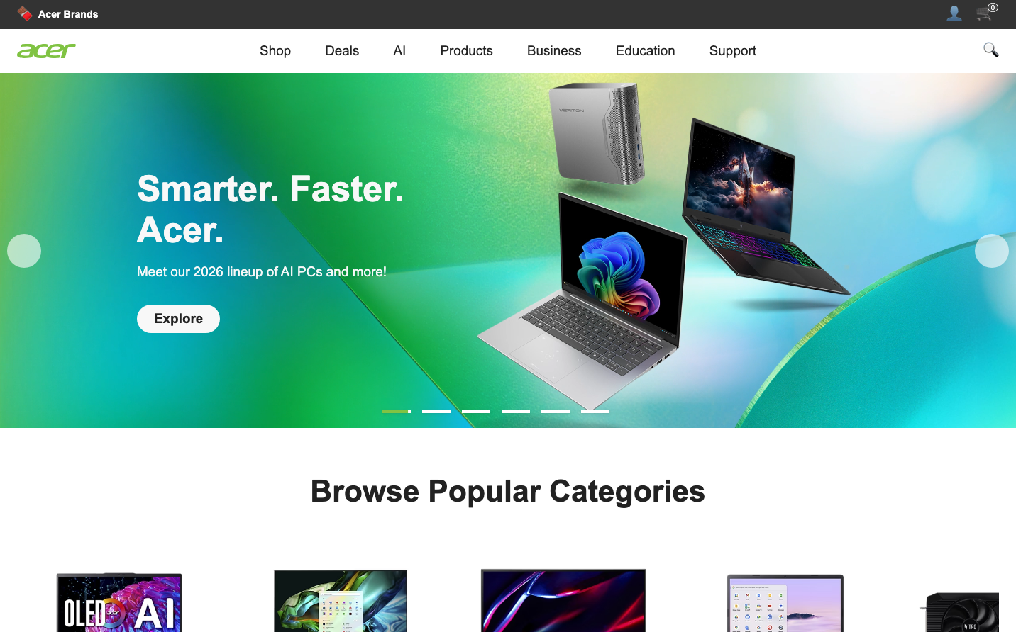
Acer
Consumer ElectronicsAcer's brand radiates tech-forward confidence through vibrant gradient backgrounds that flow from electric green to cyan blue, creating an immersive digital playground aesthetic. The bold 'Smarter. Faster. Acer.' typography commands attention while floating product imagery suggests innovation in motion, targeting users who crave cutting-edge performance.
Design Identity
Signature Color
Acer Electric Green
#00C851
High-performance innovation and gaming energy that signals advanced AI capabilities
Visual Identity
Dramatic flowing gradients that transition from electric green to cyan blue, creating an otherworldly tech environment where products appear to float in digital space
Component Style
Soft pill-shaped buttons with substantial padding that feel approachable yet premium. The 'Explore' button uses generous rounded corners (24px+) with clean typography, emphasizing accessibility over aggressive tech aesthetics.
Spacing Philosophy
Hero section dominates with expansive gradient backgrounds, while products float with generous negative space. The layout breathes with wide margins and dramatic focal points that draw attention to key messaging.
Design Principles
- Gradients flow diagonally to create movement and depth
- Product photography floats at dynamic angles, never static grid layouts
- Typography weight stays consistent at 600 for headings across all sizes
- Buttons use pill shapes with 24px+ border radius for friendly accessibility
- Color transitions always span from green-cyan spectrum for brand consistency
Target Audience
Tech enthusiasts and gamers aged 18-35 who prioritize AI-powered performance and want hardware that matches their digital-native lifestyle
Mood
Design descriptions are AI-generated based on visual analysis and may not fully reflect the brand's official design guidelines.
Design System
Typography Scale
| Element | Font | Size | Weight | Line Height |
|---|---|---|---|---|
| body | 16px | 400 | normal | |
| h1 | 50.2208px | 600 | normal | |
| h2 | 42.6824px | 600 | normal | |
| h3 | 22.0808px | 600 | normal | |
| p | 14.24px | 600 | 21.36px | |
| a | 16px | 600 | normal | |
| button | 16px | 400 | normal | |
| input | 16px | 400 | normal | |
| nav | 16px | 400 | normal | |
| header | 16px | 400 | normal |
Color Palette
#007aff