Help us build this. Leave comments, suggest improvements, and help create better design documentation for agents.
Allstate
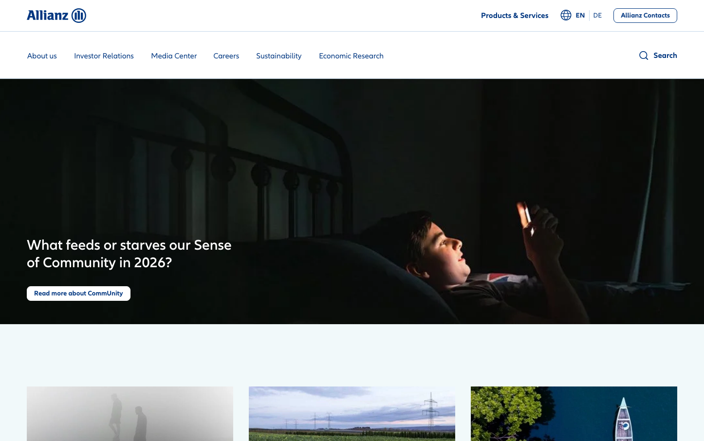
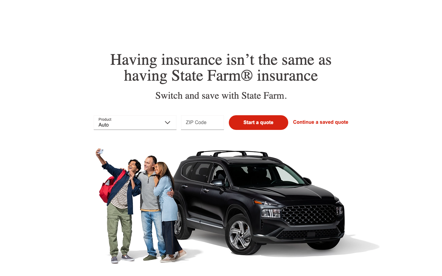
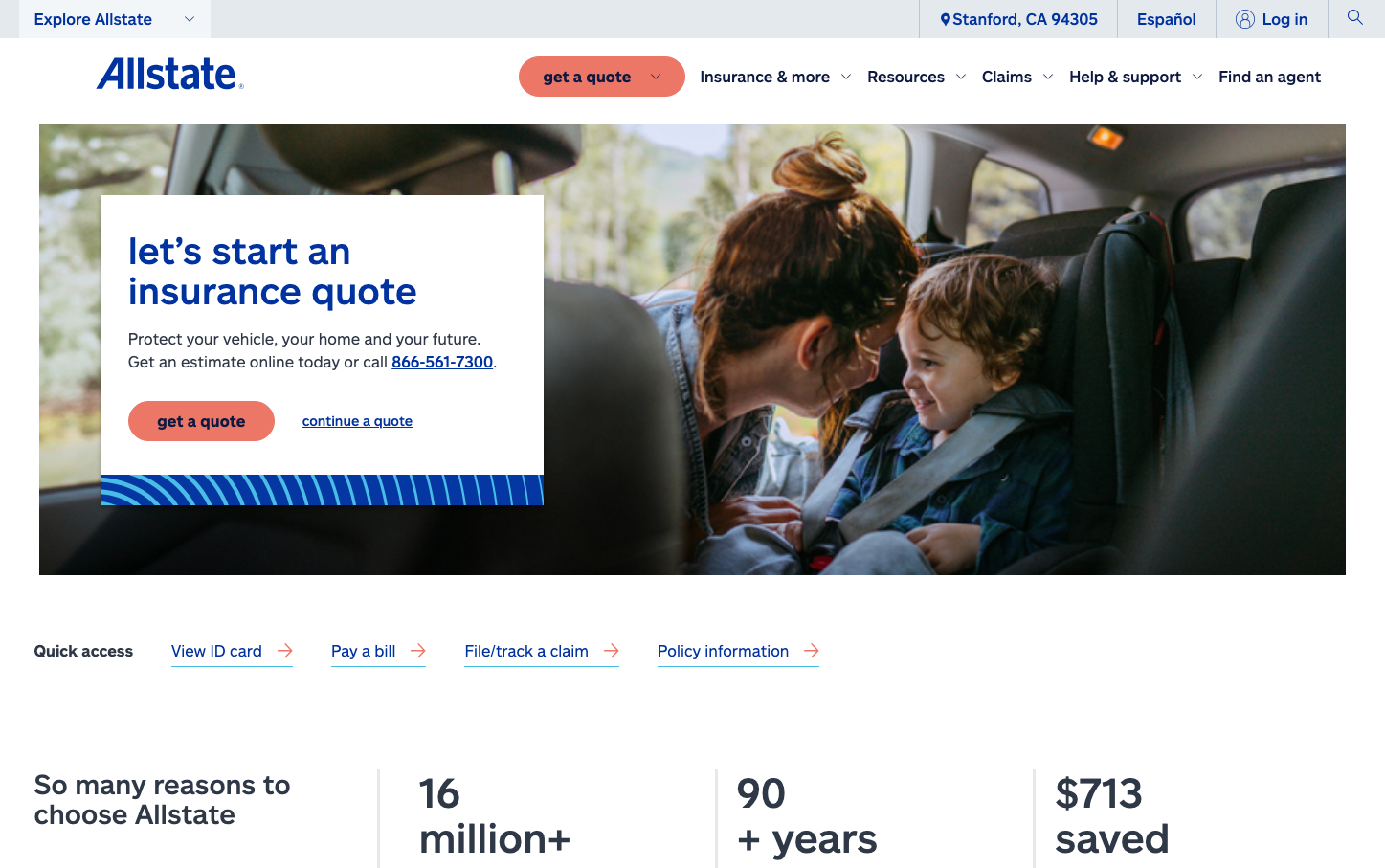
InsurtechAllstate projects approachable protection through warm coral CTAs against a foundation of trustworthy navy blue, creating a family-friendly insurance brand that feels both reliable and inviting. The intimate car interior photo with mother and child establishes emotional connection while clean typography maintains professional credibility.
Design Identity
Signature Color
Allstate Coral
#ed7766
warm approachability that softens insurance anxiety while maintaining urgency for protection
Visual Identity
Coral orange buttons as the primary interaction element against predominantly blue brand foundations - this warm accent color immediately distinguishes Allstate from competitors who rely heavily on cold blues and greens
Component Style
Soft rounded buttons with generous padding that feel friendly and approachable rather than corporate. The coral CTA buttons have substantial visual weight with rounded corners that invite interaction, contrasting against clean white cards with subtle backgrounds
Spacing Philosophy
Generous whitespace around key messaging creates breathing room that reduces insurance-related stress, while the hero section uses asymmetric layout with the quote form taking roughly 40% width to balance urgency with approachability
Design Principles
- Primary CTAs always use coral #ed7766 for warmth
- Navy blue #0e1941 provides trust foundation
- Rounded button corners never sharp to maintain friendliness
- Hero images feature real families in protective scenarios
- White space generously surrounds key conversion elements
Target Audience
Middle-income families with children who prioritize safety and need insurance to feel less intimidating and more like caring protection
Mood
Design descriptions are AI-generated based on visual analysis and may not fully reflect the brand's official design guidelines.
Design System
Typography Scale
| Element | Font | Size | Weight | Line Height |
|---|---|---|---|---|
| body | 16px | 400 | 24px | |
| h1 | 38.4px | 400 | 42.24px | |
| h2 | 28px | 400 | 30.8px | |
| h3 | 42px | 400 | 46.2px | |
| p | 20px | 400 | 30px | |
| a | 16px | 400 | 24px | |
| button | 13.3333px | 400 | normal | |
| input | 16px | 400 | 24px | |
| nav | 16px | 400 | 24px | |
| footer | 12px | 400 | 18px |
Color Palette
#0033a0#45bce5#d9eeff#ed7766#f3f7fb#bdbdbd#0e1941