Help us build this. Leave comments, suggest improvements, and help create better design documentation for agents.
AMD
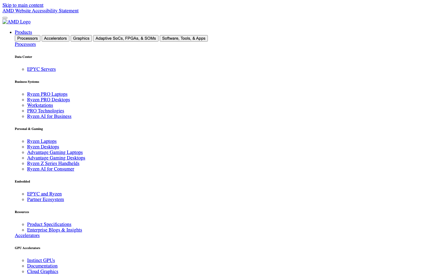
Consumer ElectronicsAMD's brand identity is rooted in utilitarian hierarchy and technical precision, using Times serif typography to convey established authority in semiconductor engineering. The stark, text-heavy navigation creates an encyclopedia-like atmosphere that prioritizes comprehensive product information over visual polish.
Design Identity
Signature Color
AMD Technical Blue
#0000EE
Classic hyperlink blue that signals deep technical documentation and engineering reliability
Visual Identity
Dense, hierarchical text navigation with serif typography and minimal visual styling - instantly recognizable as a technical specification hub rather than a marketing-driven interface
Component Style
Pure text links with browser-default styling, no custom buttons or cards visible. Everything relies on typographic hierarchy and indentation rather than visual containers or modern UI components.
Spacing Philosophy
Compact, information-dense layout with tight line spacing and nested indentation patterns. Space is used functionally for hierarchy rather than aesthetically for breathing room.
Design Principles
- Typography over graphics - all navigation is pure text
- Functional hierarchy through indentation and font weight
- Browser-default link styling maintains technical authenticity
- No visual effects or modern UI patterns
- Content density prioritized over whitespace
Target Audience
Hardware engineers, system integrators, and technical decision-makers who need comprehensive product specifications and detailed technical documentation
Mood
Design descriptions are AI-generated based on visual analysis and may not fully reflect the brand's official design guidelines.
Design System
Typography Scale
| Element | Font | Size | Weight | Line Height |
|---|---|---|---|---|
| body | 16px | 400 | normal | |
| h1 | 32px | 700 | normal | |
| h2 | 24px | 700 | normal | |
| h3 | 18.72px | 700 | normal | |
| h5 | 13.28px | 700 | normal | |
| h6 | 10.72px | 700 | normal | |
| p | 16px | 400 | normal | |
| a | 16px | 400 | normal | |
| button | 13.3333px | 400 | normal | |
| nav | 16px | 400 | normal |
Color Palette
#ffffff#f6ce3c