Help us build this. Leave comments, suggest improvements, and help create better design documentation for agents.
Amplitude
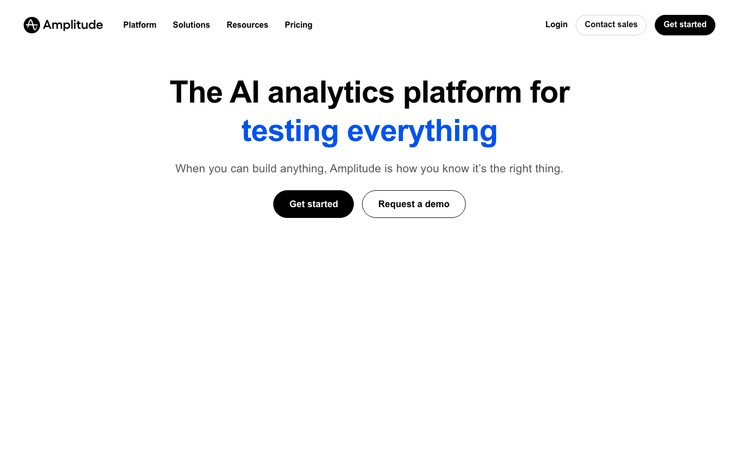
SaaSAmplitude embraces confident, humanistic typography with Gellix paired with dramatically generous white space and a striking electric blue that demands attention. The design feels like a premium analytics tool for sophisticated teams - bold headlines float in vast minimalism, while the electric blue accent creates tension against the clean backdrop.
Design Identity
Signature Color
Electric Analytics Blue
#4285F4
Data-driven intelligence and trustworthy insights - the color of digital transformation
Visual Identity
Massive typographic headlines floating in expansive white space with surgical precision - if you see oversized bold text with cathedral-like breathing room, it's unmistakably Amplitude.
Component Style
Pill-shaped buttons with substantial padding create friendly approachability, while maintaining sharp typographic hierarchy. Primary actions use full corner rounding (24px+) with solid fills, secondary actions stay outlined with matching curves - everything feels substantial but never heavy.
Spacing Philosophy
Cathedral spacing philosophy - massive 80px+ gaps between major sections create a sense of premium breathing room, while headlines get their own generous vertical territory. Content floats in carefully orchestrated white space that makes every element feel intentional.
Design Principles
- Headlines use 60px bold Gellix with 70px line height for maximum impact
- Body text stays at 18px with 28px line height for comfortable reading
- Primary buttons use full pill shapes (24px+ border radius) with 16px 32px padding
- White space between major sections never drops below 64px
- Blue accent color appears sparingly but with high contrast for maximum attention
- Typography hierarchy jumps dramatically between sizes - no subtle variations
Target Audience
Senior product managers and growth teams at scale-up companies who need sophisticated analytics but value design craft and user experience over feature density
Mood
Design descriptions are AI-generated based on visual analysis and may not fully reflect the brand's official design guidelines.
Design System
Typography Scale
| Element | Font | Size | Weight | Line Height |
|---|---|---|---|---|
| body | 18px | 400 | 28px | |
| h1 | 60px | 700 | 70px | |
| h2 | 44px | 600 | 29px | |
| h3 | 44px | 600 | 48px | |
| h4 | 16px | 600 | 21.6px | |
| h6 | 22px | 500 | 24px | |
| p | 22px | 500 | 20px | |
| a | 18px | 400 | 28px | |
| button | 18px | 400 | 28px | |
| nav | 18px | 400 | 28px |
Color Palette
#ffffff#3b82f6