Help us build this. Leave comments, suggest improvements, and help create better design documentation for agents.
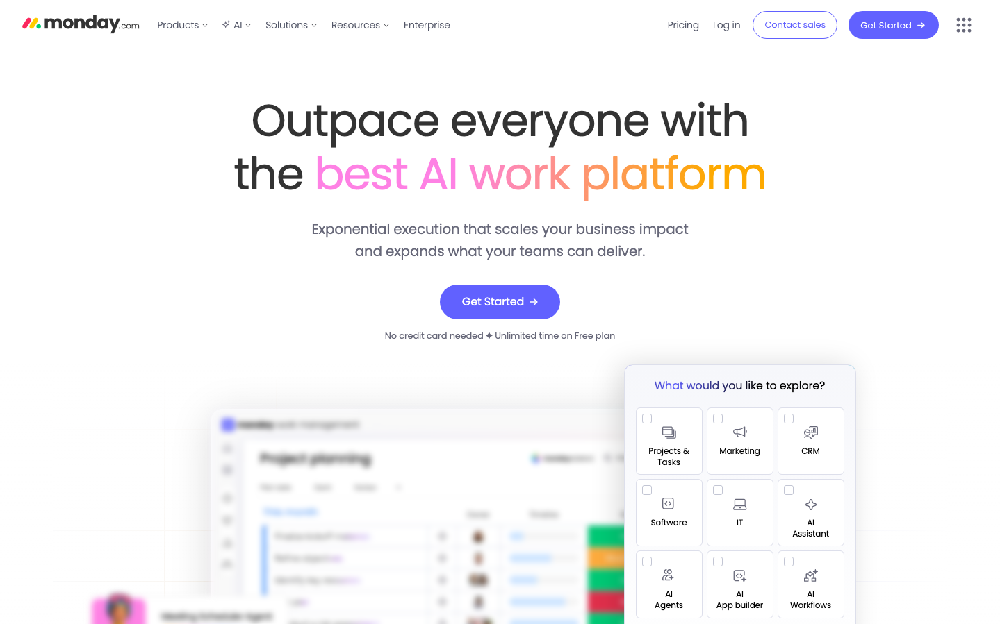
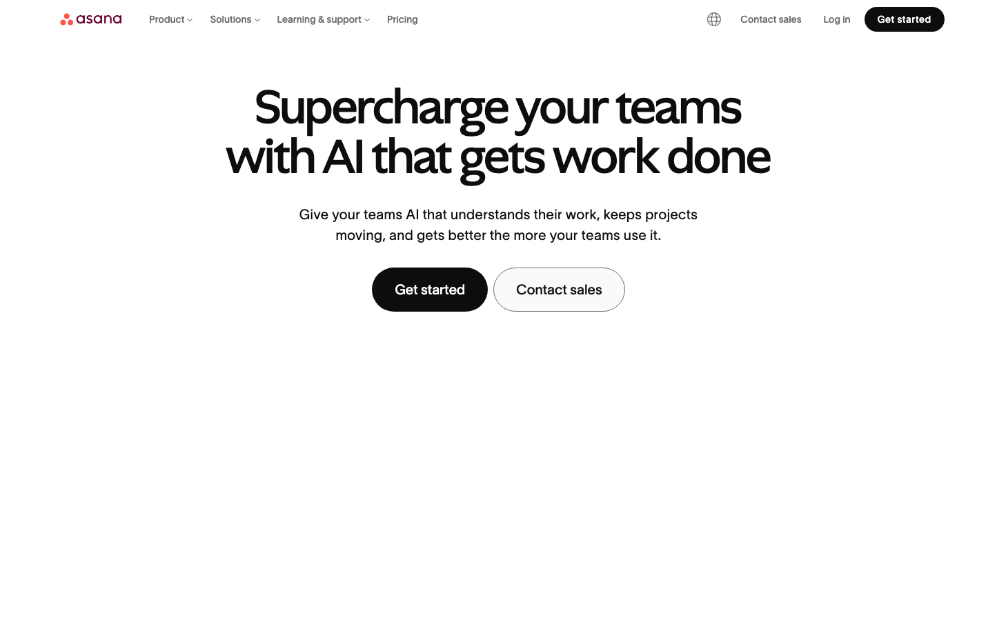
Asana
ProductivityAsana embraces a confident minimalist aesthetic with expansive white space and bold, centered typography that creates an almost zen-like focus on productivity. The Ghost and TWK Lausanne font pairing delivers editorial sophistication while the stark black-on-white composition communicates clarity and purposeful simplicity.
Design Identity
Signature Color
Asana Black
#000000
absolute clarity and decisiveness - cutting through workplace complexity with unwavering focus
Visual Identity
Massive amounts of breathing room around ultra-bold, centered typography creates an almost magazine-editorial layout that feels more like premium publishing than typical SaaS
Component Style
Buttons are pill-shaped with generous horizontal padding and medium border radius (~24-32px), creating friendly approachability. The primary CTA uses pure black backgrounds while secondary buttons maintain clean outlines with ample whitespace.
Spacing Philosophy
Cathedral-like vertical spacing with enormous gaps between sections creates a sense of calm and importance. Text and buttons are given room to breathe, suggesting premium positioning over information density.
Design Principles
- Border radius stays minimal at 3px for cards, but buttons get generous pill treatment
- Typography hierarchy jumps dramatically from 72px headlines to 16px body
- Shadows are extremely subtle with low opacity (0.12-0.15 max)
- Transitions are swift at 75-150ms for snappy interactions
- Black text on pure white dominates with no color distractions
Target Audience
Executive-level project managers and team leads who value sophisticated simplicity over feature complexity
Mood
Design descriptions are AI-generated based on visual analysis and may not fully reflect the brand's official design guidelines.
Design System
Typography Scale
| Element | Font | Size | Weight | Line Height |
|---|---|---|---|---|
| body | 16px | 400 | 28px | |
| h1 | 72px | 500 | 72px | |
| h2 | 60px | 500 | 60px | |
| h3 | 12px | 500 | 12px | |
| h4 | 30px | 400 | 36px | |
| h5 | 24px | 500 | 28.8px | |
| h6 | 16px | 500 | 24px | |
| p | 20px | 300 | 30px | |
| a | 16px | 500 | 24px | |
| button | 14px | 500 | 36px |
Color Palette
#2a2b2d#252628#4c4d4e#e7e7e7#ffffff#fafafa#b6b6b6#38383a#525254#3e3f41#f3f3f3#434445