Help us build this. Leave comments, suggest improvements, and help create better design documentation for agents.
Bank of America
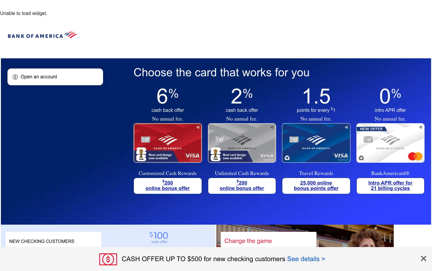
FinanceBank of America presents a bold financial authority through deep navy dominance and stark white contrast, creating an institutional confidence that feels both premium and accessible. The typography hierarchy uses custom CNX fonts for headlines paired with trustworthy Roboto for body text, establishing corporate gravitas while maintaining readability.
Design Identity
Signature Color
Executive Navy
#1A3A8A
Institutional trust and financial authority - the deep blue that communicates stability and American banking heritage
Visual Identity
The overwhelming navy background with white text creates a distinctive 'inverse' web experience that feels more like a premium financial presentation than a typical website - most banks use white backgrounds, but BofA owns the dark, authoritative space.
Component Style
Cards have subtle rounded corners (approximately 8px) with clean white backgrounds that pop against the navy. The credit card showcase uses generous whitespace and gentle shadows, creating a premium gallery feeling. Buttons appear pill-shaped with moderate padding, emphasizing approachability within the authoritative framework.
Spacing Philosophy
Generous vertical spacing between sections creates breathing room that suggests financial stability and unhurried decision-making. The card grid uses consistent gaps that allow each product to feel premium and distinct, while internal card padding is tight and efficient.
Design Principles
- Navy background dominates 80% of viewport to establish authority
- White cards with 8px border radius for premium contrast
- Typography uses exactly two font families: CNX for authority, Roboto for accessibility
- Large percentage-based numbers (6%, 2%) create immediate value recognition
- Consistent 'No annual fee' messaging reinforces value proposition
Target Audience
Middle to upper-middle class Americans seeking premium banking services who value institutional stability over trendy fintech features
Mood
Design descriptions are AI-generated based on visual analysis and may not fully reflect the brand's official design guidelines.
Design System
Typography Scale
| Element | Font | Size | Weight | Line Height |
|---|---|---|---|---|
| body | 16px | 400 | normal | |
| h1 | 32px | 400 | 44.8px | |
| h2 | 38px | 300 | 41.8px | |
| h3 | 27px | 300 | 37.8px | |
| h4 | 24px | 300 | 33.6px | |
| h5 | 18px | 300 | 25.2px | |
| p | 16px | 400 | 24px | |
| a | 14px | 400 | 18px | |
| button | 20px | 500 | 20px | |
| input | 16px | 400 | 24px |
Color Palette
No colors extracted