Help us build this. Leave comments, suggest improvements, and help create better design documentation for agents.
Basic/Dept
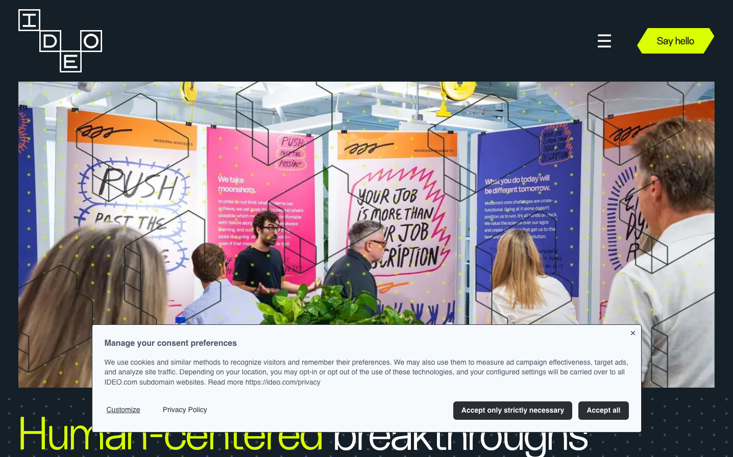
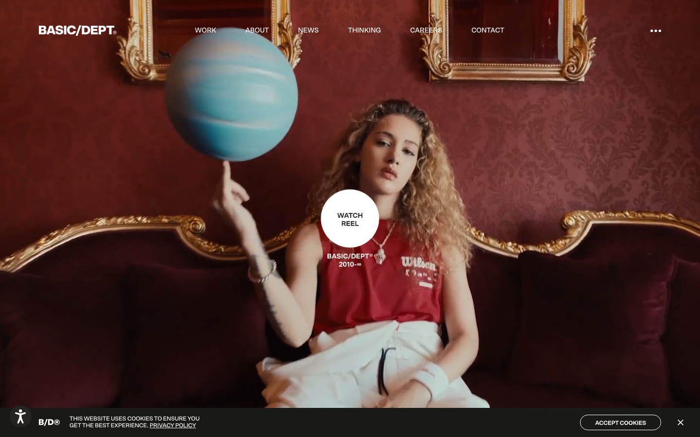
AgencyBasic/Dept creates a theatrical contrast between opulent, old-world maximalism and clean digital minimalism. The juxtaposition of ornate golden frames against burgundy walls with a sleek circular CTA creates an intentionally surreal, art-gallery-meets-startup aesthetic that feels both playful and sophisticated.
Design Identity
Signature Color
Gallery White
#ffffff
pristine creative canvas that cuts through visual noise
Visual Identity
The perfect circular white button floating over rich, textured environments - creating a portal-like effect that makes digital interactions feel magical and intentional.
Component Style
Perfectly circular buttons with generous padding create soft, approachable touchpoints. No harsh edges or shadows - everything feels organic and touchable, like art objects rather than UI elements.
Spacing Philosophy
Theatrical negative space that lets hero elements breathe dramatically. Wide margins and centered focal points create gallery-like contemplation zones rather than dense information layouts.
Design Principles
- Circular buttons only - no rectangular CTAs
- High contrast between ornate backgrounds and minimal UI
- Single focal point per screen with dramatic framing
- Typography uses SctoGroteskA exclusively across all weights
- Transitions range from 0.1s to 0.55s for theatrical timing
Target Audience
Creative directors and brand strategists who appreciate conceptual thinking over corporate efficiency
Mood
Design descriptions are AI-generated based on visual analysis and may not fully reflect the brand's official design guidelines.
Design System
Typography Scale
| Element | Font | Size | Weight | Line Height |
|---|---|---|---|---|
| body | 18px | 400 | 25.2px | |
| h2 | 42px | 700 | 46.2px | |
| h3 | 38px | 400 | 41.8px | |
| h5 | 22px | 700 | 24.2px | |
| h6 | 18px | 400 | 19.8px | |
| p | 14px | 400 | 15.96px | |
| a | 18px | 400 | 25.2px | |
| button | 18px | 400 | 25.2px | |
| input | 18px | 400 | 55px | |
| nav | 18px | 400 | 25.2px |
Color Palette
#f4f4f4#252422#f9cdcd#ffffff#191918#eaeaea#000000#5e5e5e#3a97f9#d64121#088843