Help us build this. Leave comments, suggest improvements, and help create better design documentation for agents.
Instrument
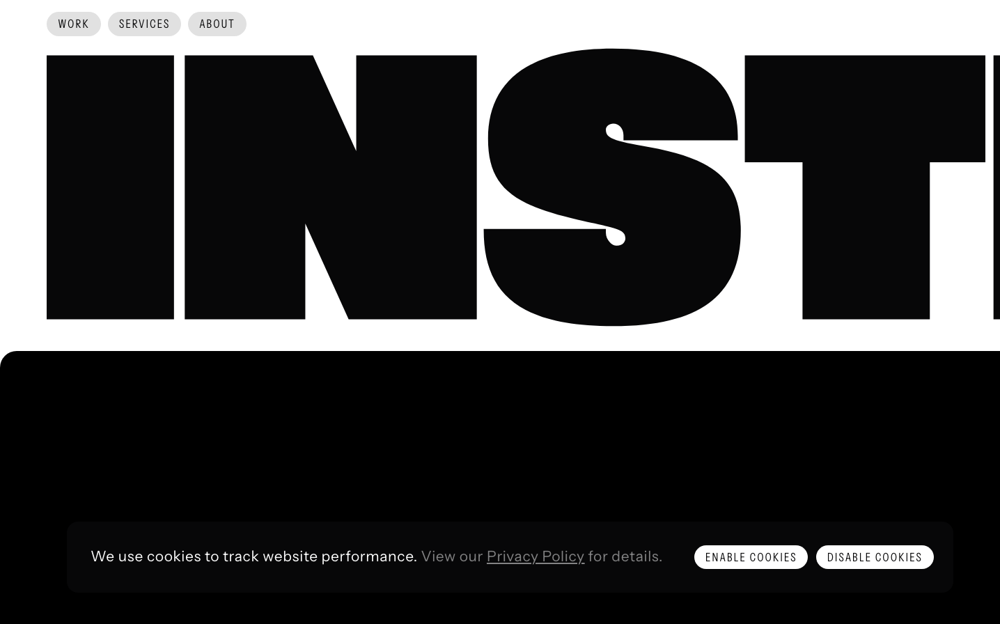
AgencyInstrument's brand screams editorial confidence through massive, brutalist typography that dominates the entire viewport. The stark black-on-white composition with minimal navigation creates an almost intimidating presence that says 'we're so good, we don't need to explain ourselves.'
Design Identity
Signature Color
Editorial Black
#000000
Uncompromising authority and creative confidence - the kind of black that prestigious design studios use to signal they're above trends
Visual Identity
The overwhelming scale of typography that fills nearly the entire screen - text so large it becomes a graphic element rather than just readable content, creating an unmistakable editorial magazine aesthetic.
Component Style
Minimal pill-shaped buttons with 24px border radius that feel soft against the brutalist typography. Clean, rounded elements that provide gentle contrast to the aggressive type treatment without competing for attention.
Spacing Philosophy
Extreme contrast between generous whitespace around minimal navigation and the claustrophobic density of oversized typography. The 8px grid creates tight precision while massive type creates dramatic tension.
Design Principles
- Typography scales to viewport-dominating sizes, becoming graphic rather than textual
- Border radius standardized at 24px for all interactive elements
- Grid gap locked to 8px base unit for micro-spacing precision
- Navigation stays minimal with only 3 essential links
- Monochromatic palette with strategic restraint
Target Audience
Creative directors and brand managers at Fortune 500 companies who need agencies that can command boardroom respect through pure creative authority
Mood
Design descriptions are AI-generated based on visual analysis and may not fully reflect the brand's official design guidelines.
Design System
Typography Scale
| Element | Font | Size | Weight | Line Height |
|---|---|---|---|---|
| body | 16px | 400 | 16px | |
| h2 | 16.8281px | 400 | 22.4375px | |
| h3 | 39.2656px | 400 | 44.875px | |
| p | 21.0352px | 400 | 33.6562px | |
| a | 21.0352px | 400 | 33.6562px | |
| button | 16.8281px | 400 | 22.4375px | |
| input | 25.2422px | 400 | 39.2656px | |
| nav | 16px | 400 | 16px | |
| header | 16px | 400 | 16px | |
| footer | 16px | 400 | 16px |
Color Palette
#007aff