Help us build this. Leave comments, suggest improvements, and help create better design documentation for agents.
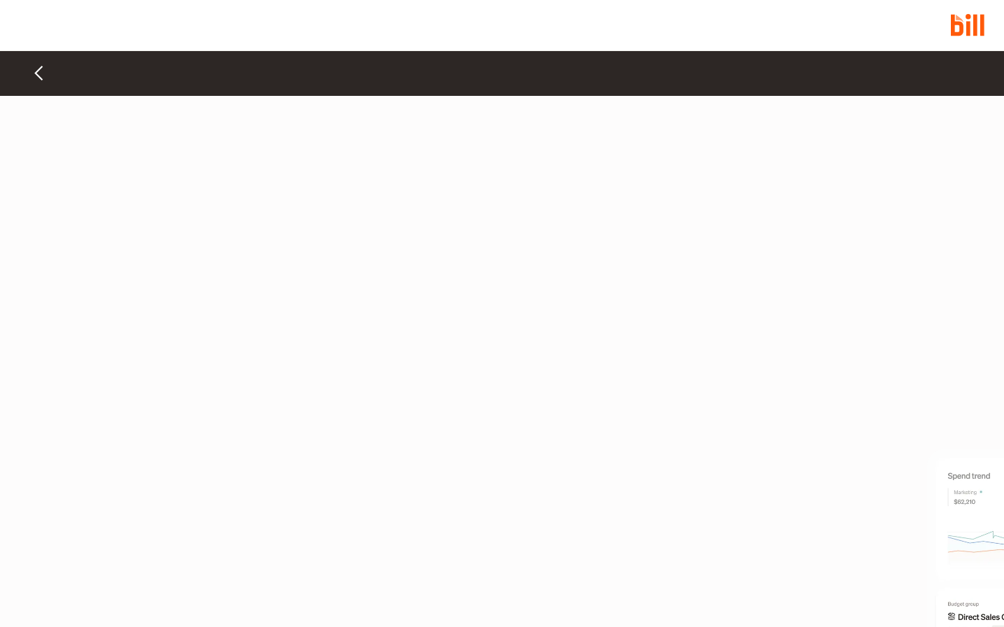
Bill
FintechBill embraces radical minimalism with an almost meditative use of negative space, punctuated by their signature vibrant orange that cuts through the pristine off-white canvas like a precise editorial mark. The custom Sohne typography creates a sophisticated financial authority through its balanced weight hierarchy and generous line spacing.
Design Identity
Signature Color
Bill Orange
#ff5a0a
energetic precision in financial operations - cuts through complexity with confident simplicity
Visual Identity
Extreme whitespace philosophy where 90% of the screen remains untouched, creating an almost gallery-like reverence for the few elements that do appear - every pixel placement feels intentional and editorial.
Component Style
Invisible-first design where components dissolve into the background until interaction - no visible borders, shadows, or containers, relying purely on typography hierarchy and strategic orange accents for navigation.
Spacing Philosophy
Cathedral-like spacing with massive breathing room between elements, creating a sense of premium simplicity where each component exists in its own sacred space - likely 80-120px gaps between major sections.
Design Principles
- Orange appears only as accent color, never as primary surface
- Typography does 80% of the visual heavy lifting
- Neutral palette stays within warm grays (#2d2725 to #fdfcfc)
- Components have no visible boundaries until activation
- Negative space outweighs content 3:1
Target Audience
CFOs and financial operations leaders at growth-stage companies who value sophisticated tools that don't compete for attention with their actual work
Mood
Design descriptions are AI-generated based on visual analysis and may not fully reflect the brand's official design guidelines.
Design System
Typography Scale
| Element | Font | Size | Weight | Line Height |
|---|---|---|---|---|
| body | 16px | 400 | 24px | |
| h1 | 68px | 500 | 68px | |
| h2 | 44px | 500 | 48.4px | |
| h3 | 32px | 500 | 35.2px | |
| h6 | 22px | 500 | 28.6px | |
| p | 20px | 400 | 30px | |
| a | 16px | 400 | 24px | |
| input | 14px | 400 | 20px | |
| nav | 16px | 400 | 24px | |
| footer | 16px | 400 | 24px |
Color Palette
#2d2725#ff5a0a#c3b4ac#161412#584f4b#fdfcfc#f1f0ec#2269d3#024dbd#f6f6f3#fff6ee#238d8c