Help us build this. Leave comments, suggest improvements, and help create better design documentation for agents.
Broadcom
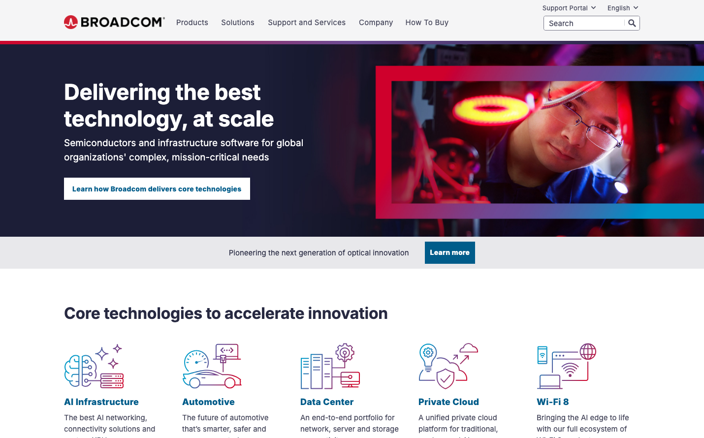
Consumer ElectronicsBroadcom employs a dramatic dark navy foundation with vibrant red accents and clinical white typography, creating an authoritative enterprise aesthetic. The typography uses Inter with heavy weights (700-800) to project engineering precision and technical confidence. The overall mood balances scientific sophistication with bold industrial energy.
Design Identity
Signature Color
Broadcom Red
#E31E24
Mission-critical reliability and engineering excellence in semiconductor innovation
Visual Identity
Dark navy backgrounds with strategic red geometric overlays and high-contrast white text create an unmistakably technical, laboratory-like atmosphere that screams enterprise semiconductor expertise.
Component Style
Sharp-cornered buttons with minimal border radius (4-6px), solid fills without shadows. Cards use clean geometric divisions with high contrast. Everything feels surgical and precise - no rounded corners or soft edges, emphasizing technical accuracy over friendliness.
Spacing Philosophy
Generous vertical spacing (40-60px between sections) creates breathing room for complex technical content, while tight internal component padding maintains information density. The layout balances enterprise authority with readability.
Design Principles
- Border radius never exceeds 6px - maintaining sharp, technical precision
- Typography weights are exclusively 400, 700, or 800 - no medium weights
- Red accent color used sparingly for maximum impact and hierarchy
- Dark navy (#2B3A52 range) dominates 70% of backgrounds
- White text maintains maximum contrast against dark surfaces
Target Audience
Enterprise semiconductor engineers, IT infrastructure decision-makers, and technical executives who value proven engineering excellence over trendy design
Mood
Design descriptions are AI-generated based on visual analysis and may not fully reflect the brand's official design guidelines.
Design System
Typography Scale
| Element | Font | Size | Weight | Line Height |
|---|---|---|---|---|
| body | 15px | 400 | 23px | |
| h1 | 44px | 700 | 54px | |
| h2 | 22px | 800 | 31px | |
| h3 | 32px | 700 | 38px | |
| h4 | 18px | 800 | 25px | |
| h5 | 14px | 700 | 21px | |
| p | 15px | 400 | 23px | |
| a | 0px | 400 | 23px | |
| button | 25px | 800 | 25px | |
| input | 15px | 400 | 23px |
Color Palette
No colors extracted