Help us build this. Leave comments, suggest improvements, and help create better design documentation for agents.
Buttondown
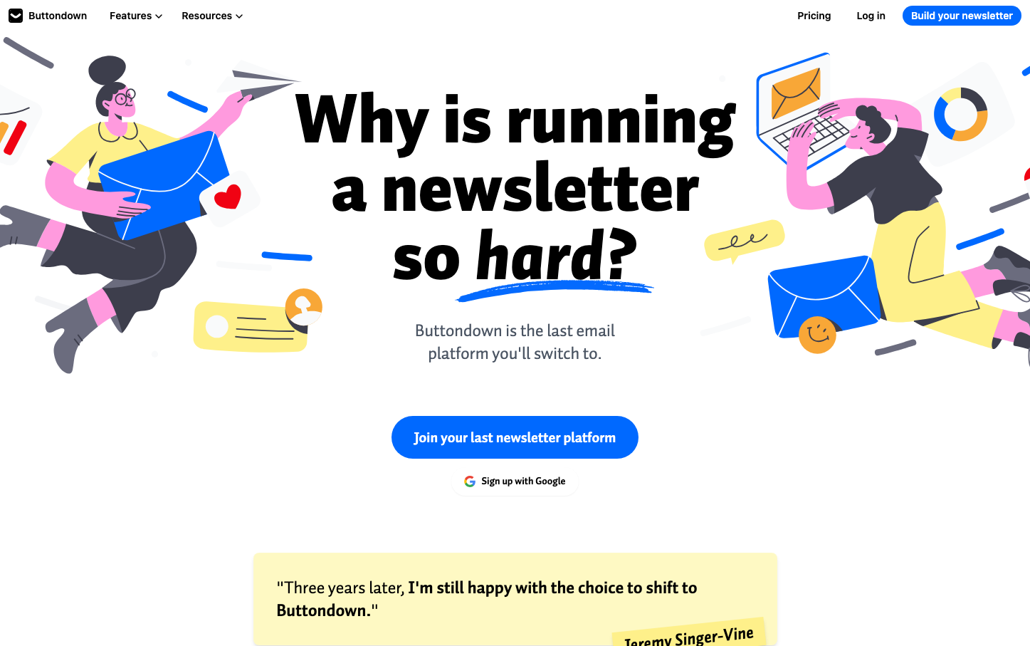
MediaButtondown embraces playful maximalism with bold hand-drawn illustrations that transform the sterile newsletter space into something joyful and approachable. The electric blue signature color cuts through chaotic, cartoon-like visuals while massive black typography creates confident hierarchy that feels both professional and whimsical.
Design Identity
Signature Color
Buttondown Blue
#0069ff
approachable expertise - technical capability wrapped in friendly confidence
Visual Identity
Distinctive hand-drawn cartoon illustrations featuring diverse characters interacting with oversized email envelopes and geometric shapes in a vibrant, scattered composition that breaks traditional SaaS minimalism
Component Style
Clean rounded buttons with generous padding and bold typography, contrasting sharply with the chaotic illustrated background. Components feel intentionally simple to let the wild illustrations be the star.
Spacing Philosophy
Breathing room around key elements like the headline and CTA buttons, while illustrations fill every corner creating controlled chaos. The layout balances dense visual storytelling with focused conversion points.
Design Principles
- Massive 96px headlines with 900 weight create undeniable presence
- Electric blue (#0069ff) is the only brand color that matters
- Hand-drawn illustrations always include diverse human characters
- White space is reserved for text hierarchy, not decoration
- Buttons use Inter while headlines use Auto Pro for contrast
Target Audience
Newsletter creators and small business owners who want powerful tools without enterprise stuffiness - people who value personality over polish
Mood
Design descriptions are AI-generated based on visual analysis and may not fully reflect the brand's official design guidelines.
Design System
Typography Scale
| Element | Font | Size | Weight | Line Height |
|---|---|---|---|---|
| body | 16px | 400 | 24px | |
| h1 | 96px | 900 | 96px | |
| h2 | 24px | 400 | 32px | |
| p | 24px | 400 | 32px | |
| a | 14px | 700 | 20px | |
| button | 14px | 600 | 20px | |
| input | 16px | 400 | 24px | |
| nav | 16px | 400 | 24px |
Color Palette
#ffffff#0069ff#f3f4f6#000000