Help us build this. Leave comments, suggest improvements, and help create better design documentation for agents.
Hashnode
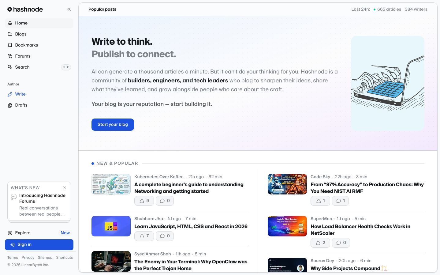
MediaHashnode employs a sophisticated editorial aesthetic that balances professional blogging with community warmth. The SuisseIntl typography creates a Swiss-inspired, literary atmosphere while the vibrant blue CTA and playful illustration inject approachable energy into an otherwise minimal, content-focused layout.
Design Identity
Signature Color
Hashnode Editorial Blue
#2563eb
trusted knowledge sharing and professional developer community
Visual Identity
The distinctive three-column sidebar navigation with generous whitespace and the signature editorial illustration style - warm, human characters in modern workspace settings that make technical content feel approachable and community-driven.
Component Style
Soft, approachable components with moderate 6-8px border radius. Buttons feel substantial with generous padding, while cards use subtle borders and minimal shadows. Everything has a slightly rounded, friendly feel rather than sharp corporate edges.
Spacing Philosophy
Editorial magazine spacing - generous 32-48px gaps between major sections create breathing room for content consumption, while sidebar navigation uses tight 16px spacing for efficient scanning. The layout prioritizes reading comfort over density.
Design Principles
- Typography uses SuisseIntl exclusively for brand consistency
- Primary actions use vibrant blue (#2563eb) against neutral grays
- Border radius stays consistent at 6-8px for friendly approachability
- Illustrations always feature warm, human workspace scenes
- Three-column layout maintains consistent 240px sidebar width
Target Audience
Technical writers and developer advocates who value thoughtful content creation over rapid posting - professionals building reputation through quality blogging
Mood
Design descriptions are AI-generated based on visual analysis and may not fully reflect the brand's official design guidelines.
Design System
Typography Scale
| Element | Font | Size | Weight | Line Height |
|---|---|---|---|---|
| body | 16px | 400 | 24px | |
| h1 | 14px | 600 | 20px | |
| h2 | 16px | 700 | 24px | |
| h3 | 16px | 700 | 22px | |
| p | 14px | 500 | 19.25px | |
| a | 16px | 400 | 24px | |
| button | 14px | 500 | 20px | |
| nav | 16px | 400 | 24px | |
| header | 16px | 400 | 24px | |
| main | 16px | 400 | 24px |
Color Palette
#ffffff#000000