Help us build this. Leave comments, suggest improvements, and help create better design documentation for agents.
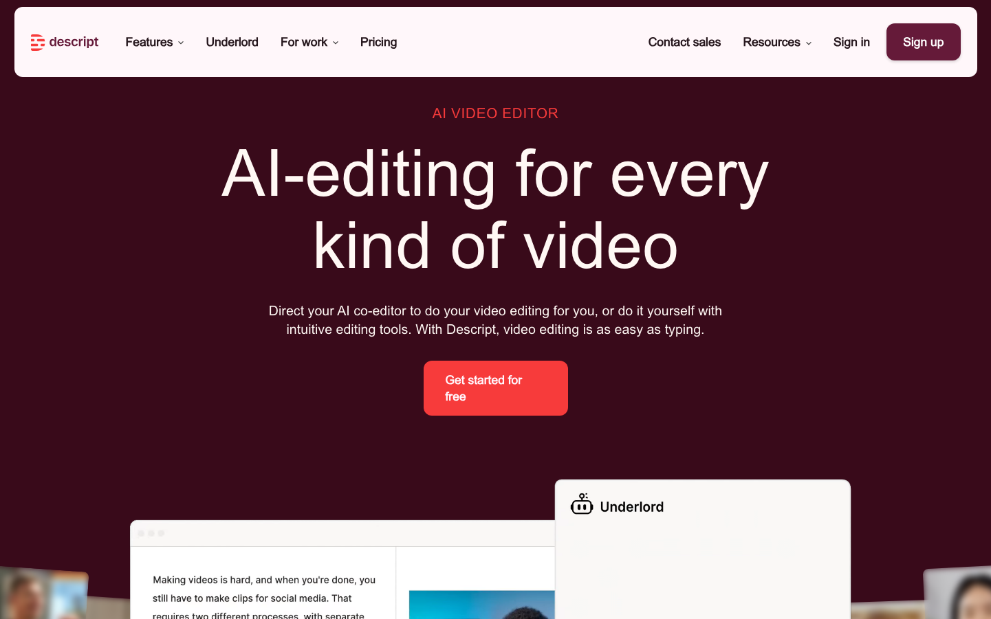
Descript
MediaDescript embraces a cinematic nocturnal aesthetic with a rich burgundy-to-maroon gradient background that feels like a premium movie theater experience. The typography balances technical precision with creative warmth, using custom fonts that suggest both AI sophistication and human-centered design.
Design Identity
Signature Color
Descript Coral
#ff4757
Creative energy and approachable AI - bridging the gap between technical power and human creativity
Visual Identity
The dramatic dark burgundy gradient background creates an immersive, cinema-like atmosphere that immediately distinguishes it from typical SaaS products with their white backgrounds.
Component Style
Rounded buttons with substantial padding and vibrant coral backgrounds that pop against the dark theme. Cards have subtle rounded corners with clean white backgrounds that create strong contrast. No heavy shadows - everything feels modern and flat with gentle curves.
Spacing Philosophy
Generous vertical spacing creates a cinematic, breathable feel. The hero section uses dramatic scale with large text and ample whitespace, while components maintain comfortable 16-24px internal padding.
Design Principles
- Dark backgrounds with high-contrast white content areas
- Coral accent color used sparingly for primary actions
- Custom font pairing: Brett for headings, Booton for body text
- Button border radius around 8-12px for friendly approachability
- 600 font weight for most interactive elements and emphasis
Target Audience
Content creators and video professionals who want AI-powered efficiency without sacrificing creative control - podcasters, YouTubers, and media teams who value both innovation and craft
Mood
Design descriptions are AI-generated based on visual analysis and may not fully reflect the brand's official design guidelines.
Design System
Typography Scale
| Element | Font | Size | Weight | Line Height |
|---|---|---|---|---|
| body | 16px | 400 | 24px | |
| h1 | 18px | 400 | 18px | |
| h2 | 18px | 400 | 18px | |
| h3 | 20px | 600 | 30px | |
| p | 16px | 600 | 24px | |
| a | 16px | 600 | 24px | |
| button | 16px | 400 | 24px | |
| nav | 16px | 600 | 24px | |
| main | 16px | 400 | 24px |
Color Palette
#3b82f6#ffffff