Help us build this. Leave comments, suggest improvements, and help create better design documentation for agents.
Cabify
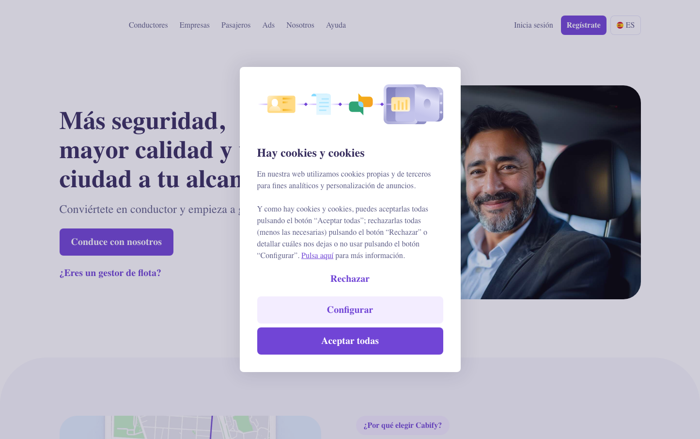
MobilityCabify's brand exudes premium mobility sophistication through a rich purple-driven palette that feels both trustworthy and forward-thinking. The CabifyCircular typography creates approachable professionalism while generous rounded corners and cookie notification overlay suggest inclusive, user-friendly transportation technology.
Design Identity
Signature Color
Cabify Purple
#7171b3
premium mobility trust - sophisticated enough for business travelers yet approachable for everyday rides
Visual Identity
The distinctive combination of deep purples with warm accent colors and consistently rounded corners at 8px+ radius creates an unmistakably friendly yet professional mobility platform aesthetic.
Component Style
Buttons feature substantial 8px+ border radius with rich purple backgrounds and smooth 0.5s transitions. Cards and modals use generous rounded corners (36-48px) creating a pillow-soft, approachable feel that contrasts sharply with typical tech angularity.
Spacing Philosophy
Generous 24px grid gaps create breathing room befitting premium service expectations, while the prominent cookie modal demonstrates confident use of overlay space to communicate transparently with users.
Design Principles
- Border radius starts at 8px minimum, scaling dramatically to 240px for hero elements
- Purple dominates with NT500 (#7171b3) as the signature brand color
- Typography uses only CabifyCircular at consistent weights: 400, 450, 600
- All interactions include 0.5s ease transitions for premium feel
- Color palette balances cool purples with warm oranges and corals for human touch
Target Audience
Urban professionals and frequent travelers who value reliable premium transportation with transparent, user-friendly technology platforms
Mood
Design descriptions are AI-generated based on visual analysis and may not fully reflect the brand's official design guidelines.
Design System
Typography Scale
| Element | Font | Size | Weight | Line Height |
|---|---|---|---|---|
| body | 16px | 400 | 24px | |
| h1 | 52px | 600 | 60px | |
| h2 | 40px | 600 | 48px | |
| h3 | 40px | 600 | 48px | |
| p | 18px | 450 | 26px | |
| a | 16px | 600 | 24px | |
| button | 16px | 400 | 0px | |
| input | 16px | 400 | 18.4px | |
| nav | 16px | 400 | 24px | |
| header | 16px | 400 | 24px |
Color Palette
#4694fa#e5f0ff#7171b3#d57351#d2bfff#e4e4f7#ffdbee#8383ad#b696ff#cc524a#834e3c#fc8549