Help us build this. Leave comments, suggest improvements, and help create better design documentation for agents.
Gogoro
MobilityGogoro's identity merges electric vitality with industrial precision through vibrant lime green accents against sophisticated charcoal and teal foundations. The typography strikes a balance between technical authority and approachable warmth, while the electric color palette communicates sustainable innovation and urban energy.
Design Identity
Signature Color
Electric Lime
#c0df16
sustainable innovation and electric energy revolution
Visual Identity
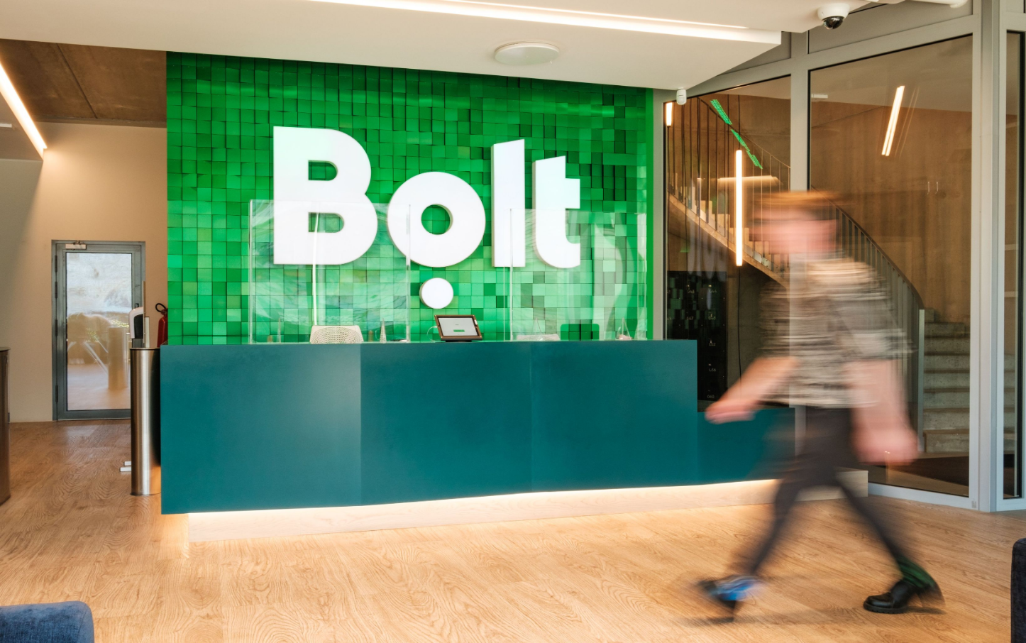
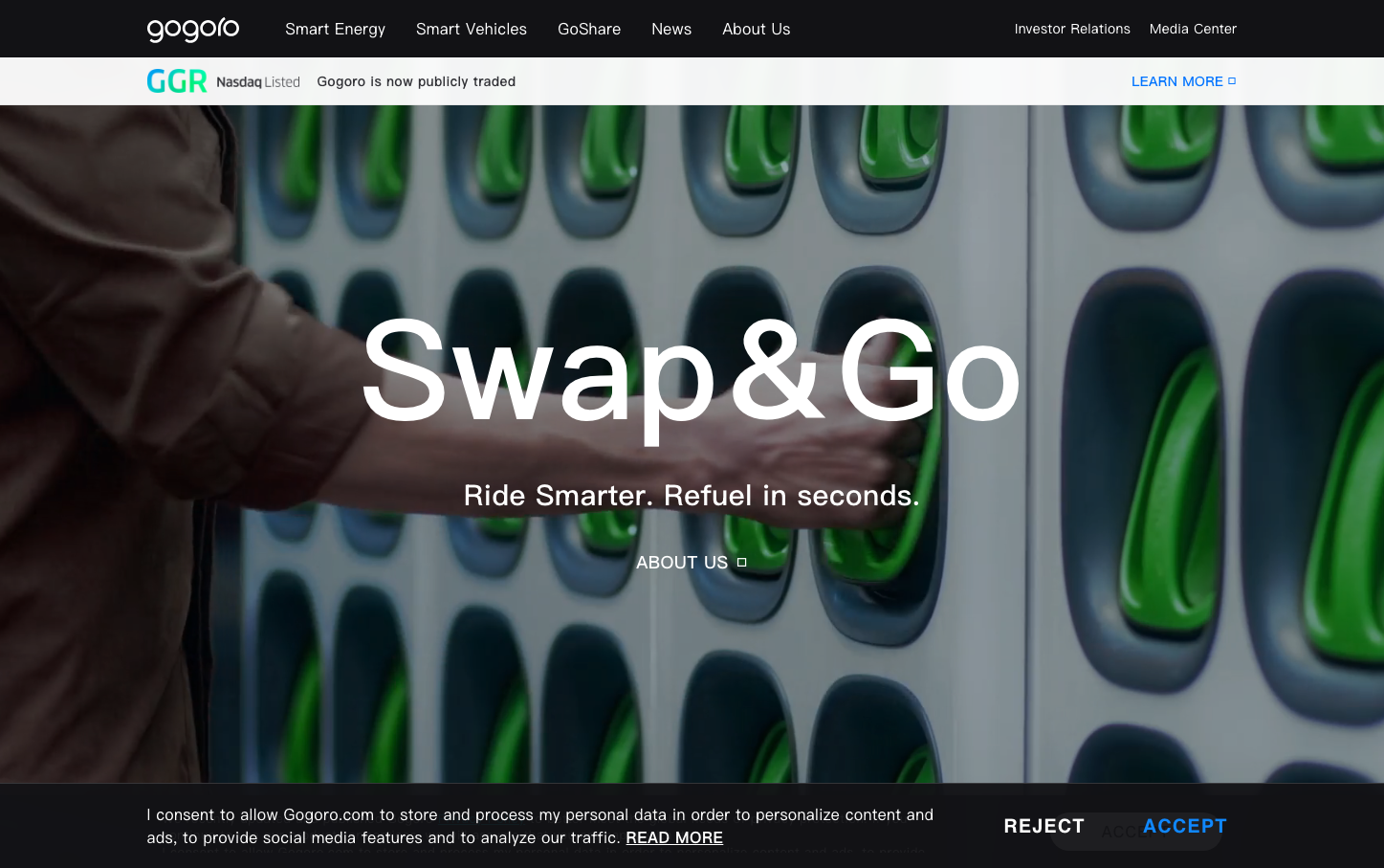
The distinctive electric lime green accents against deep teals and industrial grays, combined with photography showing battery swap technology in action, creates an unmistakable tech-forward sustainability aesthetic.
Component Style
Clean, minimal components with subtle rounded corners and no heavy shadows - buttons feel substantial but refined, maintaining the electric vehicle industry's precision while staying approachable through moderate padding and clear typography hierarchy.
Spacing Philosophy
Generous breathing room with hero sections that allow the dramatic product photography to dominate, while maintaining tight, organized spacing in navigation and UI elements to reflect technical precision.
Design Principles
- Electric lime green used sparingly as primary accent color
- Graphik typography family across all elements for consistency
- Charcoal (#323237) for primary text, never pure black
- Button font weight always 500 for subtle emphasis
- Hero typography scales dramatically to 144.7px for impact
Target Audience
Urban professionals and tech-savvy commuters who prioritize sustainability and appreciate sophisticated design over flashy marketing
Mood
Design descriptions are AI-generated based on visual analysis and may not fully reflect the brand's official design guidelines.
Design System
Typography Scale
| Element | Font | Size | Weight | Line Height |
|---|---|---|---|---|
| body | 18px | 400 | normal | |
| h2 | 144.7px | 500 | 159.17px | |
| h3 | 36px | 600 | 43.2px | |
| h4 | 24px | 600 | 30px | |
| p | 13px | 400 | 17.29px | |
| a | 18px | 400 | normal | |
| button | 16px | 500 | normal | |
| input | 18px | 400 | normal | |
| nav | 18px | 400 | normal | |
| footer | 13px | 400 | normal |
Color Palette
#323237#f1f3f3#b9bcbf#737d82#00d7ff#0069d2#24586e#112f3b#e1ff32#c0df16#28e1a5#00b946