Help us build this. Leave comments, suggest improvements, and help create better design documentation for agents.
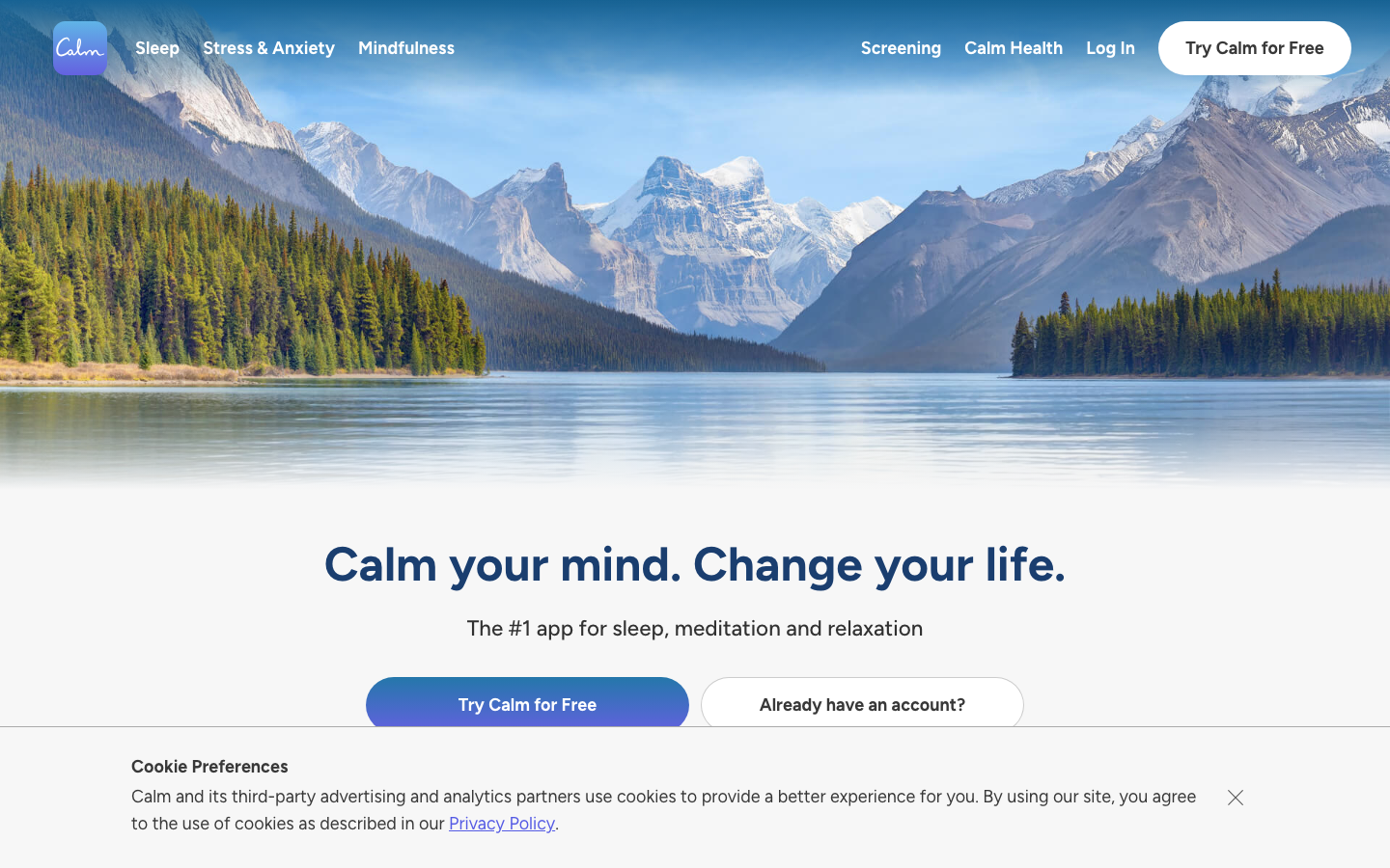
Calm
HealthcareCalm creates a transcendent wellness aesthetic through expansive mountain lake photography paired with the warm, friendly Figtree typeface. The brand uses generous whitespace and cinematic nature imagery to evoke deep tranquility and mental clarity, positioning meditation as an aspirational lifestyle choice rather than clinical therapy.
Design Identity
Signature Color
Calm Blue
#4285F4
serene mindfulness and digital wellness trust - the color of clear skies and peaceful water
Visual Identity
Cinematic nature photography as hero backgrounds with minimal text overlays, creating an immersive portal-like effect that instantly transports users to a peaceful mental state
Component Style
Soft pill-shaped buttons with generous padding and no harsh shadows - everything feels cushioned and approachable. The primary CTA uses a warm blue-to-purple gradient that mimics sunset skies, while secondary elements maintain clean transparency.
Spacing Philosophy
Breathing room philosophy with massive hero sections that let nature imagery dominate. Minimal UI elements float over photography with ample padding, creating a sense of spaciousness that mirrors the mental clarity the app promises.
Design Principles
- Hero images must be full-screen and nature-focused
- Maximum 2-3 UI elements visible at once
- Button border radius always 24px+ for soft, non-threatening feel
- Typography uses only Figtree weights: 400, 500, 700
- CTAs use gradient backgrounds, never flat colors
Target Audience
Wellness-conscious millennials and Gen Z who view self-care as essential lifestyle investment and prefer premium, Instagram-worthy experiences over clinical health apps
Mood
Design descriptions are AI-generated based on visual analysis and may not fully reflect the brand's official design guidelines.
Design System
Typography Scale
| Element | Font | Size | Weight | Line Height |
|---|---|---|---|---|
| body | 16px | 400 | normal | |
| h1 | 49.5px | 700 | 74.25px | |
| h2 | 36px | 700 | 60px | |
| h3 | 31.5px | 500 | 48px | |
| p | 22.5px | 500 | 28px | |
| a | 16px | 700 | normal | |
| button | 18px | 700 | normal | |
| nav | 16px | 400 | normal | |
| header | 16px | 400 | normal | |
| footer | 16px | 400 | normal |
Color Palette
No colors extracted