Help us build this. Leave comments, suggest improvements, and help create better design documentation for agents.
Noom
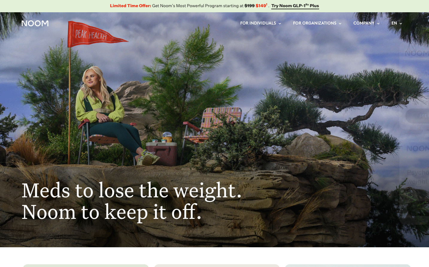
HealthcareNoom creates a naturalistic, organic brand experience that feels like wellness made tangible. The brand combines earthy nature-inspired colors with an editorial serif-sans contrast, creating an approachable yet authoritative health companion aesthetic.
Design Identity
Signature Color
Noom Sprout
#a9d15a
Growth-oriented wellness - fresh, optimistic, and naturally vibrant like new life emerging
Visual Identity
The distinctive combination of photorealistic outdoor lifestyle scenes with playful editorial typography creates an 'aspirational nature documentary' feeling - serious health content delivered through whimsical, adventure-seeking visuals.
Component Style
Components feel organic and soft with natural shadows (6px 6px 9px rgba(0,0,0,0.2)) that mimic real-world lighting. Everything has gentle curves and earthy depth rather than flat digital aesthetics - buttons and cards feel like they exist in physical space.
Spacing Philosophy
Generous breathing room mirrors outdoor expansiveness - large hero sections with dramatic imagery create immersive moments, while content areas use comfortable reading distances that feel like flipping through a premium lifestyle magazine.
Design Principles
- Headlines use 72px serif to create editorial authority while body text stays at comfortable 16px sans-serif
- Natural shadows (6px 6px 9px) are preferred over flat designs to create tactile depth
- Color palette strictly follows nature gradient from dark pine (#2b4010) to bright sprout (#a9d15a)
- Typography contrast: serif for headlines, sans-serif for interface - never mix within same element
- Photography always features real environments, never studio shots or illustrations
Target Audience
Health-conscious adults aged 28-45 who prefer evidence-based approaches over fad diets, value sustainable lifestyle changes, and see wellness as a journey rather than a quick fix
Mood
Design descriptions are AI-generated based on visual analysis and may not fully reflect the brand's official design guidelines.
Design System
Typography Scale
| Element | Font | Size | Weight | Line Height |
|---|---|---|---|---|
| body | 16px | 400 | 27.2px | |
| h1 | 72px | 400 | 72px | |
| h2 | 32px | 400 | 32px | |
| h3 | 22.08px | 400 | 30.4704px | |
| h6 | 14px | 600 | 14px | |
| p | 16px | 400 | 27.2px | |
| a | 16px | 400 | 27.2px | |
| nav | 16px | 400 | 27.2px | |
| header | 16px | 400 | 27.2px | |
| footer | 16px | 400 | 27.2px |
Color Palette
#000000#abb8c3#ffffff#f78da7#cf2e2e#ff6900#fcb900#7bdcb5#00d084#8ed1fc#0693e3#9b51e0