Help us build this. Leave comments, suggest improvements, and help create better design documentation for agents.
One Medical
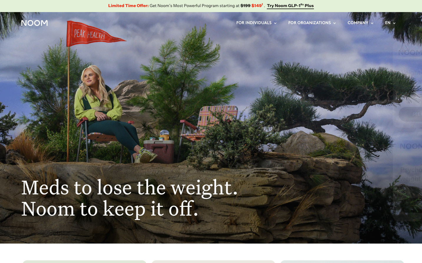
HealthcareOne Medical creates a premium healthcare experience through oversized serif headlines paired with understated sans-serif body text, establishing editorial sophistication. The hero uses warm human imagery against clean white space, while their signature medical blue creates trust without feeling clinical.

Design Identity
Signature Color
Medical Trust Blue
#4285F4
approachable healthcare technology that feels both trustworthy and human
Visual Identity
Massive GT Super Display serif headlines dominating generous white space, creating an editorial magazine aesthetic that humanizes healthcare technology.
Component Style
Softly rounded buttons with substantial padding feel approachable and finger-friendly. Clean pill-shaped forms with minimal borders prioritize accessibility over sharpness - everything breathes with gentle curves.
Spacing Philosophy
Luxurious breathing room with hero sections spanning full viewport height. Generous 48-64px gaps between major sections create a premium, unhurried feeling that contrasts typical healthcare urgency.
Design Principles
- Headlines use GT Super Display serif at massive 72-88px sizes for editorial impact
- Body text stays light at 200 weight for easy scanning
- Button radius around 24px for soft, approachable feeling
- Primary actions use medical blue with high contrast white text
- Human photography always includes genuine smiles and natural poses
Target Audience
Health-conscious professionals who expect premium service design and view healthcare as a lifestyle investment rather than necessity
Mood
Design descriptions are AI-generated based on visual analysis and may not fully reflect the brand's official design guidelines.
Design System
Typography Scale
| Element | Font | Size | Weight | Line Height |
|---|---|---|---|---|
| body | 18px | 200 | 31.5px | |
| h1 | 72px | 500 | 72px | |
| h2 | 88px | 600 | 94.248px | |
| h3 | 32px | 500 | 40px | |
| h6 | 14px | 600 | 24.5px | |
| p | 18px | 200 | 31.5px | |
| a | 18px | 600 | 31.5px | |
| button | 14px | 600 | normal | |
| input | 13.3333px | 400 | normal | |
| nav | 18px | 200 | 31.5px |
Color Palette
No colors extracted