Help us build this. Leave comments, suggest improvements, and help create better design documentation for agents.
Chargebee
SaaSChargebee employs a bold, vibrant orange as its signature accent against clean whites and muted blues, creating an energetic yet professional fintech aesthetic. The Sora display font for headings paired with Inter body text signals modern sophistication, while the bright orange CTAs inject urgency and conversion-focused psychology into an otherwise restrained palette.
Design Identity
Signature Color
Chargebee Flame Orange
#FF4D00
conversion-focused urgency with fintech energy
Visual Identity
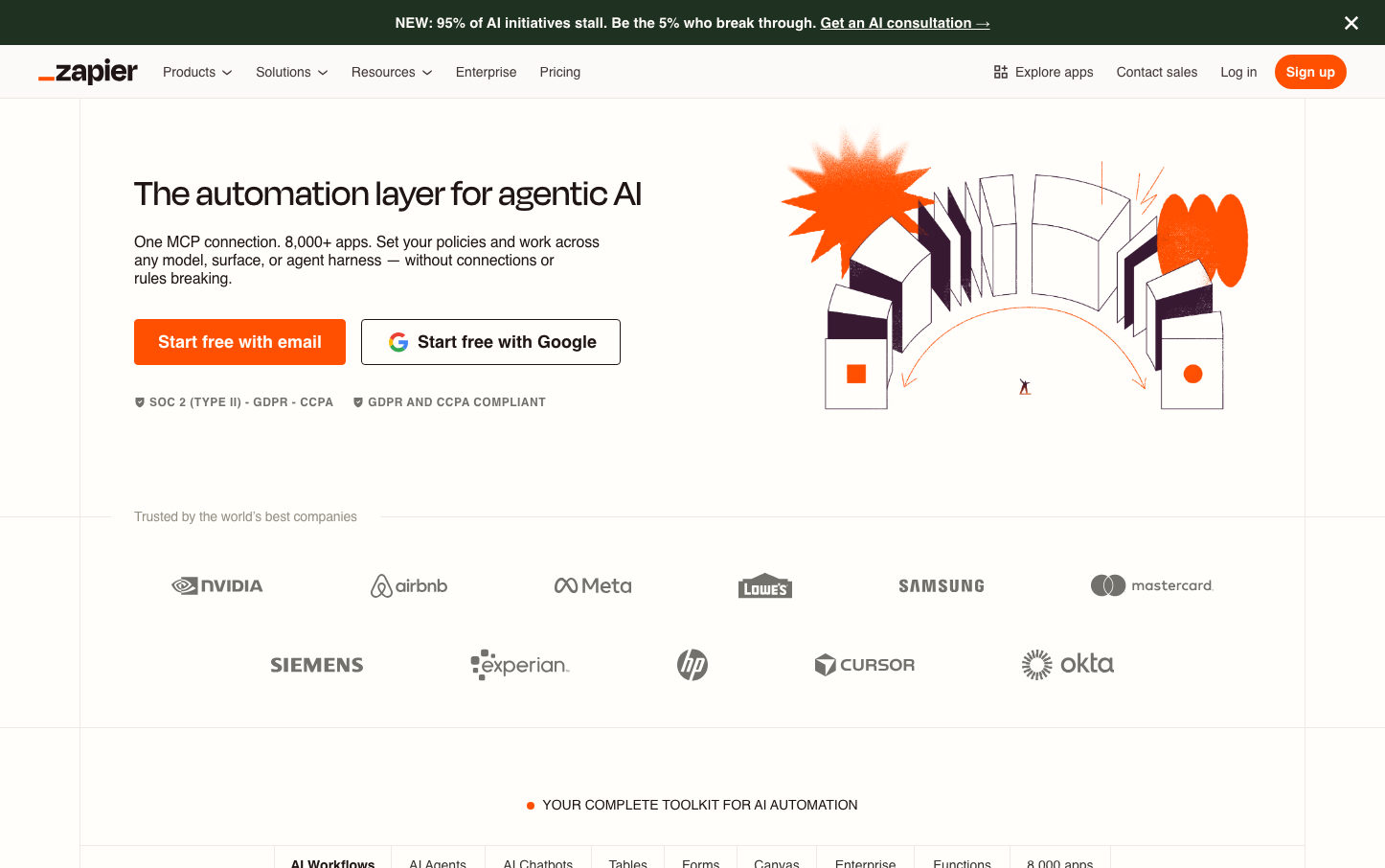
The striking flame orange primary buttons against predominantly blue-white compositions create an unmistakable high-contrast system that prioritizes conversion actions above all else.
Component Style
Buttons feature moderate 6-8px border radius with bold Sora typography, creating substantial click targets with friendly-yet-professional rounded corners. The orange primary buttons have strong visual weight while secondary buttons maintain subtle outlines, following conversion-optimized hierarchy patterns.
Spacing Philosophy
Generous whitespace with approximately 48-64px section breaks creates breathing room, while tighter 16-24px internal component spacing maintains density. The layout balances enterprise credibility with startup approachability through measured spacing rhythms.
Design Principles
- Orange CTAs dominate visual hierarchy for maximum conversion focus
- Sora headings at 48px with 700 weight create strong typographic presence
- Border radius stays consistent at 6-8px across all interactive elements
- Blue accents (#3b82f6) support but never compete with orange primaries
- Inter body text at 16px maintains high readability for complex billing content
Target Audience
SaaS founders and finance teams who need sophisticated billing automation but want approachable, conversion-optimized interfaces over enterprise complexity
Mood
Design descriptions are AI-generated based on visual analysis and may not fully reflect the brand's official design guidelines.
Design System
Typography Scale
| Element | Font | Size | Weight | Line Height |
|---|---|---|---|---|
| body | 16px | 400 | 24px | |
| h1 | 48px | 700 | 51.6px | |
| h2 | 22px | 700 | 34px | |
| h3 | 16px | 400 | 24px | |
| p | 16px | 400 | 21.888px | |
| a | 16px | 400 | 24px | |
| button | 16px | 700 | 25px | |
| input | 16px | 400 | 24px | |
| nav | 16px | 400 | 24px | |
| header | 16px | 400 | 24px |
Color Palette
#3b82f6#ffffff