Help us build this. Leave comments, suggest improvements, and help create better design documentation for agents.
Clip
FintechClip projects confident fintech energy through its signature vibrant orange that commands attention like a safety vest or sports team color. The Inter typography creates professional trust while the bold orange-and-white aesthetic feels approachable yet serious about payment processing.
Design Identity
Signature Color
Clip Orange
#FF4500
energetic fintech confidence that stands out in busy retail environments
Visual Identity
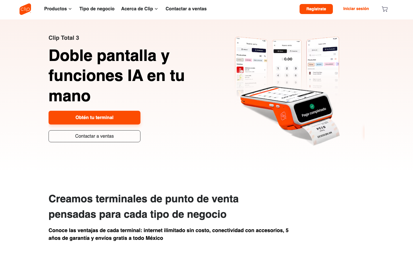
The vibrant orange payment terminal device prominently displayed alongside clean mobile app mockups creates an unmistakable hardware-meets-software identity that screams modern point-of-sale.
Component Style
Rounded rectangular buttons with substantial padding, clean card-like layouts for the mobile screens, and a mix of solid orange CTAs with outlined secondary actions. Everything feels substantial and tap-friendly for retail environments.
Spacing Philosophy
Generous whitespace around the hero terminal image creates focus, while tight groupings of mobile app screens suggest feature density. The layout breathes but keeps related elements clustered for quick scanning.
Design Principles
- Orange dominates as the primary brand color across all touchpoints
- Product imagery always shows the physical terminal as the hero
- Mobile app screens display in clean mockups showing real functionality
- Typography uses Inter with heavy weights for impact (900 for major headlines)
- Buttons use rounded corners, never sharp edges
Target Audience
Mexican small business owners and merchants who need reliable, modern payment processing solutions with integrated POS features
Mood
Design descriptions are AI-generated based on visual analysis and may not fully reflect the brand's official design guidelines.
Design System
Typography Scale
| Element | Font | Size | Weight | Line Height |
|---|---|---|---|---|
| body | 15.9958px | 400 | 23.9938px | |
| h1 | 20px | 600 | 22px | |
| h2 | 35.9906px | 900 | 53.986px | |
| h3 | 31.9917px | 700 | 47.9875px | |
| p | 14px | 700 | 21px | |
| a | 15.9958px | 400 | 23.9938px | |
| button | 15.9958px | 400 | 23.9938px | |
| nav | 15.9958px | 400 | 23.9938px | |
| header | 15.9958px | 400 | 23.9938px | |
| footer | 15.9958px | 400 | 23.9938px |
Color Palette
No colors extracted