Help us build this. Leave comments, suggest improvements, and help create better design documentation for agents.
Coatue
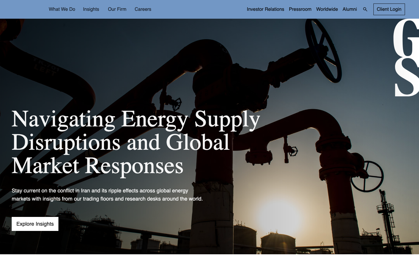
FinanceCoatue embodies institutional investment sophistication through stark monochromatic contrast and ultra-light typography that feels like premium financial editorial. The dark charcoal backgrounds create dramatic focal points while the thin Helvetica weights suggest precision and restraint.

Design Identity
Signature Color
Coatue Charcoal
#2a2d3a
institutional sophistication and investment gravitas
Visual Identity
Dramatic dark rectangular sections with ultra-thin typography that creates high editorial contrast against bright white backgrounds - feels like a premium financial magazine layout
Component Style
Clean rectangular cards with no visible borders or shadows, relying purely on background color contrast. Components feel editorial with generous internal padding and crisp edges.
Spacing Philosophy
Magazine-like spacing with large content blocks separated by significant white space, creating breathing room that suggests premium positioning and unhurried decision-making
Design Principles
- Ultra-light font weights (300) for all display typography
- Stark background color contrast instead of borders or shadows
- Rectangular geometry with no rounded corners
- Minimal color palette - primarily monochromatic
- Editorial-style layout with distinct content sections
Target Audience
Institutional investors and high-net-worth individuals who value understated sophistication over flashy design
Mood
Design descriptions are AI-generated based on visual analysis and may not fully reflect the brand's official design guidelines.
Design System
Typography Scale
| Element | Font | Size | Weight | Line Height |
|---|---|---|---|---|
| body | 16px | 400 | 24px | |
| h1 | 80px | 300 | 120px | |
| p | 50px | 300 | 60px | |
| a | 16px | 400 | 24px | |
| button | 16px | 400 | 16px | |
| nav | 16px | 400 | 24px | |
| header | 16px | 400 | 24px | |
| footer | 16px | 400 | 24px | |
| main | 16px | 400 | 24px |
Color Palette
#007aff#ffffff