Help us build this. Leave comments, suggest improvements, and help create better design documentation for agents.
Coda
ProductivityCoda presents a warm, approachable productivity aesthetic anchored by a peach-cream background that feels human and organic rather than sterile tech. The typography mix of bold Calibre headlines with clean Inter UI text creates a confident yet accessible personality that bridges creative and technical work.
Design Identity
Signature Color
Coda Cream
#FDF2E9
warm productivity that values human comfort over clinical efficiency
Visual Identity
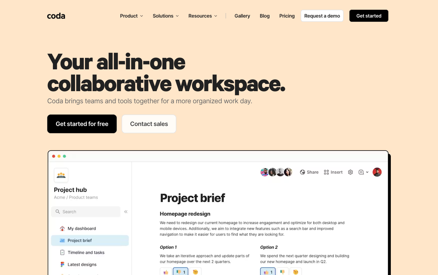
The distinctive warm cream background combined with the specific mix of bold sans-serif headlines and the collaborative workspace interface showing real project content with team avatars.
Component Style
Rounded modern components with generous padding and subtle shadows. The black primary button contrasts sharply against the cream background, while the interface preview shows clean cards with soft edges and collaborative elements like team avatars prominently displayed.
Spacing Philosophy
Generous breathing room with large sections separated by significant whitespace. The layout prioritizes comfort over density, with the product interface taking up substantial real estate to showcase functionality.
Design Principles
- Warm backgrounds over stark white to reduce eye strain
- Bold 72px headlines for maximum impact and confidence
- High contrast CTAs (black on cream) for clear hierarchy
- Collaborative elements always visible (team avatars, sharing options)
- Interface previews show real project content, not abstract mockups
Target Audience
Product teams and creative professionals who want powerful collaboration tools without the intimidation factor of traditional enterprise software
Mood
Design descriptions are AI-generated based on visual analysis and may not fully reflect the brand's official design guidelines.
Design System
Typography Scale
| Element | Font | Size | Weight | Line Height |
|---|---|---|---|---|
| body | 14px | 400 | 20px | |
| h1 | 72px | 700 | 72px | |
| h2 | 38px | 700 | 41.8px | |
| p | 72px | 700 | 72px | |
| a | 14px | 400 | 20px | |
| button | 16px | 600 | 24px | |
| nav | 14px | 400 | 20px | |
| header | 14px | 400 | 20px | |
| footer | 14px | 400 | 20px |
Color Palette
No colors extracted