Help us build this. Leave comments, suggest improvements, and help create better design documentation for agents.
Dana
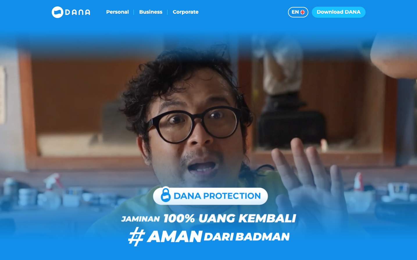
FintechDana employs a vibrant sky blue as its dominant brand color, creating an optimistic and trustworthy atmosphere that suggests financial freedom and reliability. The Montserrat typography reinforces accessibility and friendliness, while the conversational Indonesian messaging ('100% UANG KEMBALI', '#AMAN DARI BADMAN') positions this as a consumer-friendly fintech that speaks directly to everyday users with humor and confidence.
Design Identity
Signature Color
Dana Sky Blue
#1E90FF
trustworthy financial accessibility with optimistic energy
Visual Identity
The bold blue gradient overlay treatment combined with conversational Indonesian copy and hashtag-style messaging creates an instantly recognizable social-first financial brand aesthetic.
Component Style
Rounded pill-shaped buttons with generous padding and bold typography, designed for mobile-first interaction. Components feel approachable and finger-friendly rather than corporate or rigid.
Spacing Philosophy
Generous vertical spacing centers key messaging elements, creating breathing room that makes financial content feel less overwhelming. The layout prioritizes single focal points over dense information.
Design Principles
- Bold 700 weight typography for all key messaging
- Pill-shaped buttons with high border radius for friendly interaction
- Blue gradient overlays for brand consistency across marketing
- Indonesian language copy with hashtag integration
- Single-column mobile-first layouts
Target Audience
Indonesian consumers seeking accessible digital wallet solutions, particularly younger demographics comfortable with social media language and mobile-first experiences
Mood
Design descriptions are AI-generated based on visual analysis and may not fully reflect the brand's official design guidelines.
Design System
Typography Scale
| Element | Font | Size | Weight | Line Height |
|---|---|---|---|---|
| body | 16px | 400 | 18.4px | |
| p | 21px | 700 | 29.4px | |
| a | 16px | 400 | 18.4px | |
| button | 17px | 700 | 19.55px |
Color Palette
No colors extracted