Help us build this. Leave comments, suggest improvements, and help create better design documentation for agents.
Databricks
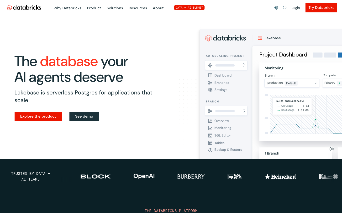
EnterpriseDatabricks projects enterprise authority through bold orange accents against pristine white interfaces, creating a confident yet approachable data platform aesthetic. The typography hierarchy uses DM Sans with dramatic scale jumps (60px headlines to 16px body) that commands attention while maintaining technical precision.
Design Identity
Signature Color
Databricks Flame
#FF3621
Data innovation energy - transforms complex analytics into actionable intelligence
Visual Identity
Asymmetric orange accent blocks paired with generous white space and stark typography scale contrasts - the interface feels like a premium technical dashboard rather than consumer software.
Component Style
Clean rectangular buttons with minimal 4-6px border radius, no shadows or heavy borders. Cards use subtle gray backgrounds with generous internal padding. Everything feels flat and purposeful - designed for focus over flourish.
Spacing Philosophy
Expansive 80-120px vertical gaps between major sections create breathing room for complex data concepts, while tight 16-24px component spacing maintains information density where needed.
Design Principles
- Orange appears only as strategic accent color, never overwhelming
- Typography jumps dramatically in scale - 60px to 16px with no intermediate sizes
- Border radius stays minimal at 4-6px maximum
- Monospace DM Mono reserved specifically for technical elements
- Interface density varies dramatically - spacious marketing, compact dashboards
Target Audience
Data engineers and analytics leaders who need enterprise-grade reliability but want modern, intuitive interfaces that don't sacrifice power for simplicity.
Mood
Design descriptions are AI-generated based on visual analysis and may not fully reflect the brand's official design guidelines.
Design System
Typography Scale
| Element | Font | Size | Weight | Line Height |
|---|---|---|---|---|
| body | 16px | 400 | 24px | |
| h1 | 60px | 500 | 66px | |
| h2 | 48px | 500 | 56px | |
| h3 | 28px | 400 | 36px | |
| h4 | 20px | 600 | 28px | |
| p | 12px | 400 | 12px | |
| a | 16px | 400 | 24px | |
| button | 16px | 400 | 24px | |
| nav | 16px | 400 | 24px | |
| footer | 16px | 400 | 24px |
Color Palette
#007aff#3b82f6#ffffff