Help us build this. Leave comments, suggest improvements, and help create better design documentation for agents.
Dev.to
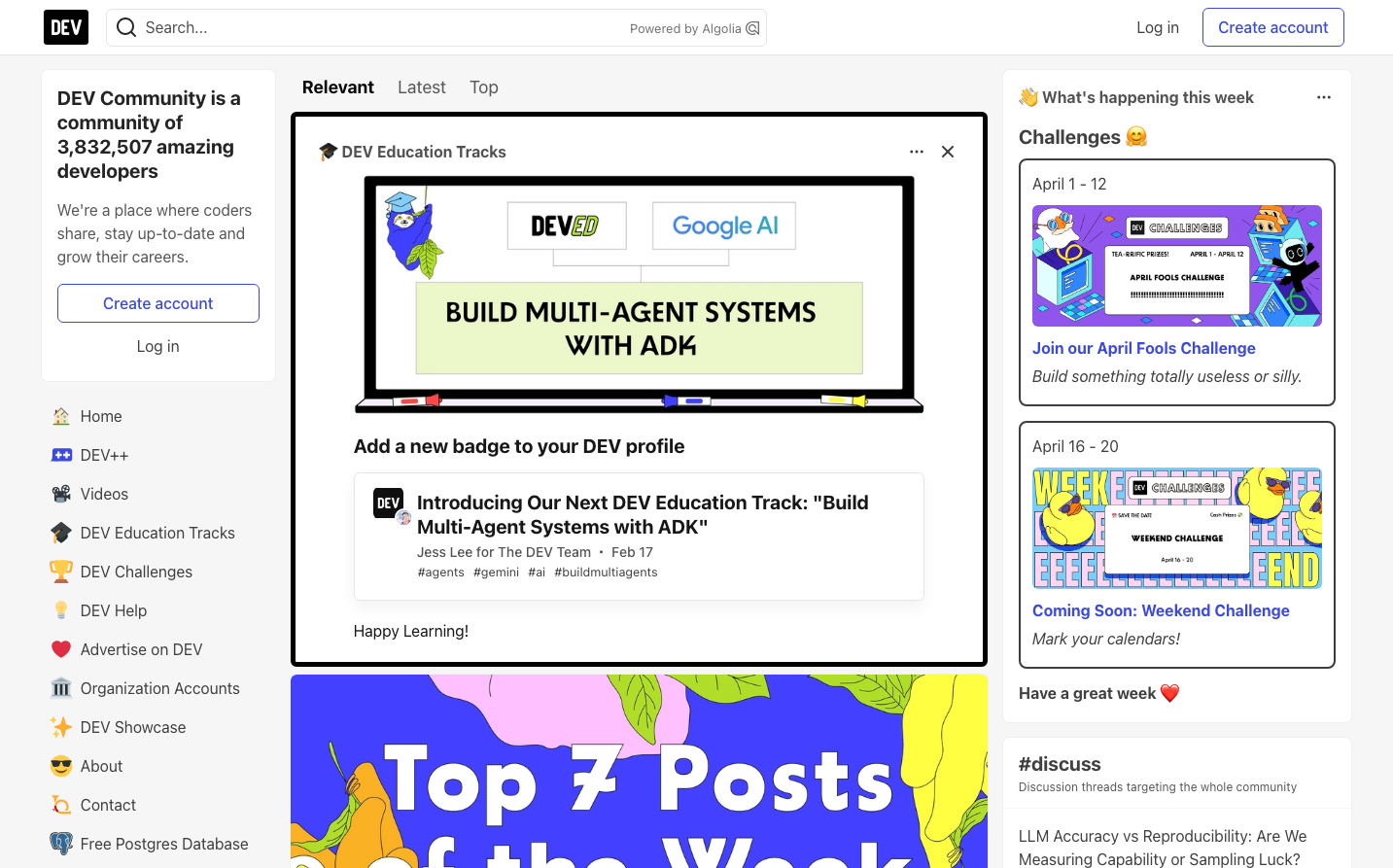
MediaDev.to embodies an approachable developer haven with warm, human touches that contrast the sterile precision of typical tech platforms. The signature blue (#3b49df) radiates trustworthy intelligence while playful illustrations and emojis create an inviting, community-first atmosphere where learning feels joyful rather than intimidating.
Design Identity
Signature Color
Dev Blue
#3b49df
approachable technical expertise - smart but never intimidating
Visual Identity
Playful educational cards with colorful illustrations mixed seamlessly with clean technical content, creating a unique blend of professionalism and personality that makes complex topics feel accessible.
Component Style
Soft rounded corners (8-12px) with subtle shadows and gentle hover states. Cards feel welcoming with light backgrounds and friendly typography. Buttons are approachable with medium padding and system font stack - nothing feels sharp or aggressive.
Spacing Philosophy
Generous breathing room between major sections (24-32px gaps) while maintaining intimate 12-16px spacing within content blocks. The layout feels organized but never cramped, encouraging exploration and reading.
Design Principles
- Border radius consistently 8-12px for friendly approachability
- System font stack prioritizes readability across all devices
- Subtle shadows (0px 8px 16px rgba(0,0,0,0.05)) add depth without drama
- Primary blue (#3b49df) reserved for key actions and education tracks
- Emojis and illustrations balance technical seriousness
Target Audience
Developers of all levels seeking community and continuous learning, particularly those who value mentorship and knowledge-sharing over competitive coding culture
Mood
Design descriptions are AI-generated based on visual analysis and may not fully reflect the brand's official design guidelines.
Design System
Typography Scale
| Element | Font | Size | Weight | Line Height |
|---|---|---|---|---|
| body | 16px | 400 | 24px | |
| h1 | 36px | 700 | 54px | |
| h2 | 18px | 700 | 22.5px | |
| h3 | 16px | 700 | 24px | |
| h4 | 16px | 700 | 20px | |
| p | 16px | 400 | 24px | |
| a | 16px | 400 | 24px | |
| button | 16px | 400 | 24px | |
| input | 16px | 400 | 24px | |
| nav | 16px | 400 | 24px |
Color Palette
#575757#404040#000000#e5e5e5#ffffff#ef4444#4f46e5#3b49df#2f3ab2#f6f6f6#3d3d3d#dc2626