Help us build this. Leave comments, suggest improvements, and help create better design documentation for agents.
The Economist
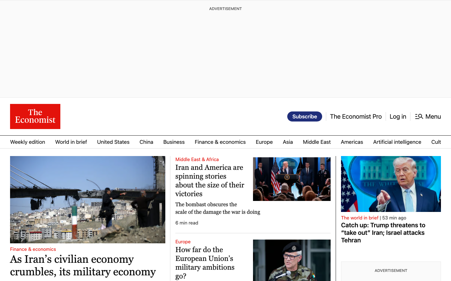
MediaThe Economist commands attention with its authoritative red masthead against clean white space, creating an instantly recognizable newsroom aesthetic. The signature red evokes urgency and breaking news authority, while the serif-dominant typography suggests scholarly credibility and traditional journalism gravitas.
Design Identity
Signature Color
Economist Red
#e3120b
Editorial authority and news urgency - the commanding red of breaking headlines and uncompromising journalism
Visual Identity
The bold red masthead logo positioned in the top-left corner with generous white space creates an unmistakable newspaper hierarchy that screams premium journalism even without reading the content.
Component Style
Clean, borderless components with subtle shadows and generous padding. The 'Subscribe' button uses rounded corners with solid fills, while article cards rely on typography hierarchy rather than heavy borders or dividers.
Spacing Philosophy
Newspaper-style generous white space with clear content sections. Large gaps between major content blocks create breathing room, while tight line spacing maintains readability density for serious readers.
Design Principles
- Red appears only in the masthead logo for maximum impact
- Serif fonts for body content, sans-serif for navigation and metadata
- Article headlines use large serif typography for gravitas
- Minimal borders - content separation through whitespace
- Blue accent colors reserved for interactive elements
Target Audience
Executive decision-makers and policy influencers who consume dense, authoritative content and value editorial reputation over flashy design
Mood
Design descriptions are AI-generated based on visual analysis and may not fully reflect the brand's official design guidelines.
Design System
Typography Scale
| Element | Font | Size | Weight | Line Height |
|---|---|---|---|---|
| body | 17px | 400 | 24px | |
| h2 | 15px | 600 | 20px | |
| h3 | 23px | 400 | 28px | |
| h4 | 20px | 500 | 24px | |
| p | 15px | 400 | 20px | |
| a | 17px | 400 | 24px | |
| button | 20px | 400 | 24px | |
| input | 17px | 400 | 24px | |
| nav | 17px | 400 | 24px | |
| header | 17px | 400 | 24px |
Color Palette
#e3120b#f6423c#141f52#1f2e7a#2e45b8#475ed1#d6dbf5#ebedfa#1dc9a4#36e2bd#d2f9f0#e9fcf8