Help us build this. Leave comments, suggest improvements, and help create better design documentation for agents.
Edwards Lifesciences
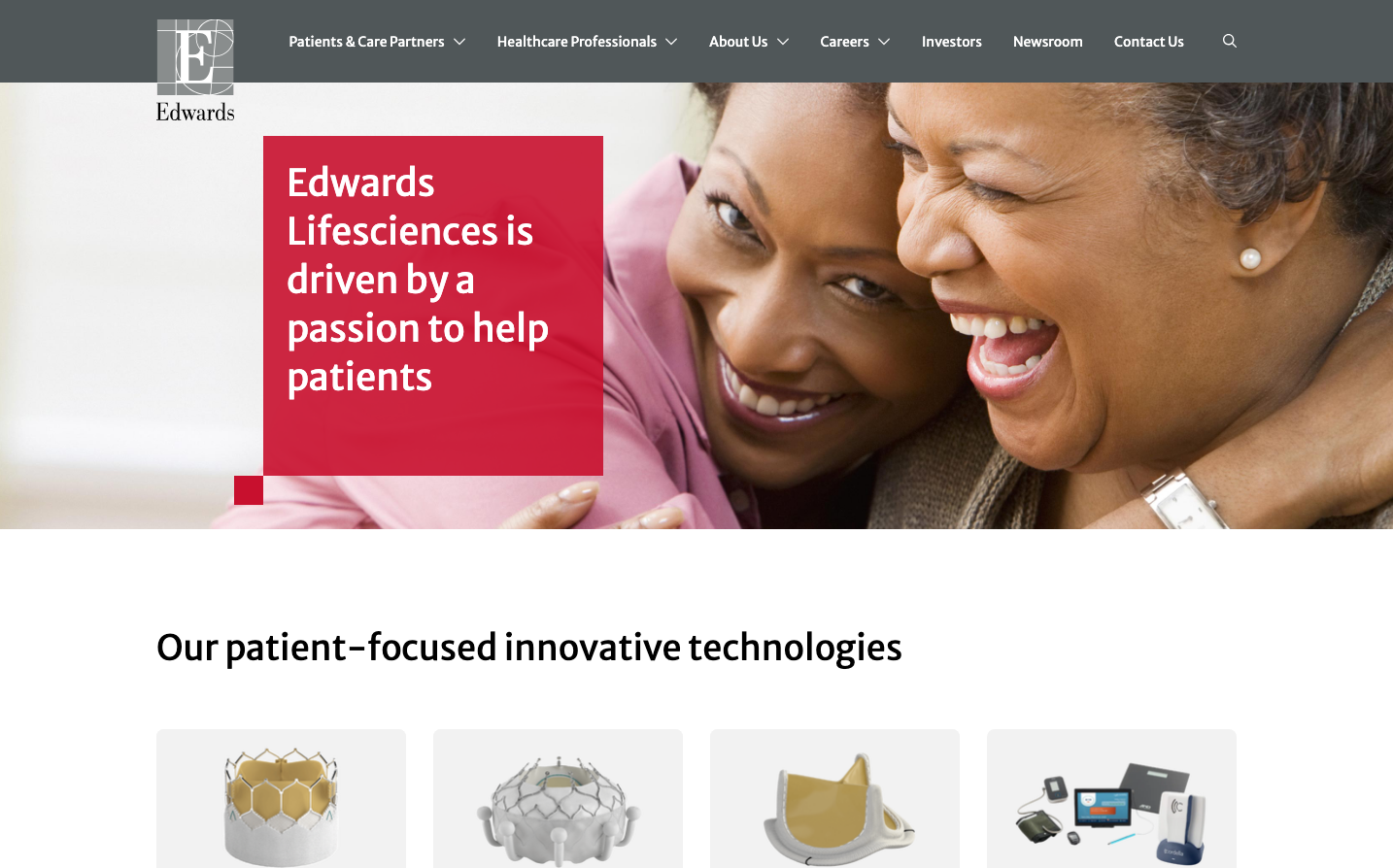
HealthcareEdwards Lifesciences uses a distinctive medical crimson red (#c8102e) to convey life-saving urgency and medical authority, paired with Merriweather Sans typography that balances professional credibility with human warmth. The design emphasizes emotional connection through intimate photography and generous spacing that feels reassuring rather than clinical.
Design Identity
Signature Color
Edwards Crimson
#c8102e
Medical urgency and life-saving innovation - commanding attention while inspiring trust in critical healthcare decisions
Visual Identity
Large, warm photographic hero sections showing genuine human moments combined with bold red text overlays positioned asymmetrically - creating an emotional healthcare brand that prioritizes human connection over sterile medical aesthetics.
Component Style
Clean, minimal components with subtle rounded corners (4-8px radius) and no heavy shadows - everything feels approachable and human-centered rather than technical. The medical device imagery uses sophisticated gold and titanium tones against clean backgrounds.
Spacing Philosophy
Generous whitespace with large section breaks creates breathing room that feels calming and trustworthy. Content is given space to resonate emotionally rather than packed densely, reflecting the gravity of life-saving medical decisions.
Design Principles
- Border radius stays between 4px-8px for subtle softness
- Typography uses only 400 and 700 weights for clear hierarchy
- Red accent color used sparingly for maximum impact
- Photography always shows real human connection and emotion
- Medical devices presented with premium metallic finishes
Target Audience
Cardiac surgeons, cardiologists, and healthcare professionals who make life-or-death decisions and need to trust in premium medical technology while maintaining focus on patient outcomes.
Mood
Design descriptions are AI-generated based on visual analysis and may not fully reflect the brand's official design guidelines.
Design System
Typography Scale
| Element | Font | Size | Weight | Line Height |
|---|---|---|---|---|
| body | 16px | 400 | 24px | |
| h1 | 38px | 400 | 50px | |
| h2 | 36px | 400 | 54px | |
| h3 | 16px | 700 | 28px | |
| h4 | 20px | 400 | 32px | |
| p | 20px | 400 | 32px | |
| a | 16px | 400 | 24px | |
| button | 14px | 400 | normal | |
| input | 20px | 400 | 30px | |
| nav | 16px | 400 | 24px |
Color Palette
#ffffff#fafafa#f5f5f5#e6e6e6#171717#c6102e#fff5f5#ffe6e6#fffbeb#fef3c8#f59f0a#f2fdf5